Four years across UI & UX, web and brand, designing accessible interface systems for products too complex to get wrong. Founder of Designstrom, serving clients across India and the UK, with design delivered inside a government PMO governance framework. Building deeper expertise through an MSc in User Experience Design at Birmingham City University.
Most screen-time tools step in when you open an app. The research showed that isn’t where people struggle: the problem comes later, deep into a session, when nothing signals it’s time to stop. Drift is an iOS concept that brings that signal back, using four escalating levels in the Dynamic Island to make you aware of how long you’ve been scrolling, without ever blocking access or taking control away from you. Grounded in four user interviews, a 20-person survey and published behavioural research.
MSc project
Behavioural design
iOS
Dynamic Island
User research
Usability testing
Design system
UX focus
Primary and secondary research, behavioural modelling, escalation logic, usability testing
Surfaces
Onboarding, main app, Dynamic Island
Key outcome
Reframed the problem from screen time to session-boundary erosion. Escalation model validated in usability testing.
"Accessible room" is a label, not an answer, so disabled travellers still phone the hotel to ask. AccessibleStay answers those questions on the page: a structured access checklist per hotel, three colour-vision modes, a captioned tour, Easy Read, and full keyboard operability. Individual MSc project, evaluated with ten participants on their own devices, then rebuilt three times on what they found.
MSc project
Accessibility
WCAG 2.2
Personas
Usability testing
Responsive web
Design system
UX focus
Persona-to-criterion traceability, inclusive design, evaluation and iteration
Surfaces
Desktop, tablet and mobile from one component library
Key outcome
90% task completion, but independent completion only 6-7 of 10, which drove a mobile and tablet rebuild and a fifth persona.
Parking sensors tell you something is wrong, never what to do about it, and by the time they sound the car is already out of line. Park AR overlays the exact steering angle onto the live camera view, colour-coded and continuous, and logs every session so a learner can see whether they are improving. My 50% share of a three-person MSc project, recorded in the submitted deck.
MSc project
Augmented reality
Automotive
Personas
Usability evaluation
Accessibility
System architecture
UX focus
Personas, scenario design, evaluation methodology and statistical analysis
Surfaces
Mobile AR overlay, instructor dashboard
Key outcome
Every usability item scored 4.75-5.0 with distraction at 1.25/5, and I flagged the ceiling effect as a sampling artefact rather than a result.
One marketplace, two audiences with opposite goals. I designed a B2B website where buyers find trusted sellers nearby and sellers run their own shopfront, covering everything from sign-up to listings, promotion and a seller insights dashboard across web and mobile.
Marketplace
Two-sided platform
Dashboard design
Onboarding & OTP
Responsive web
Mobile app
Design system
UX focus
Information architecture, two-sided flows, form design, dashboard hierarchy
Platforms
Responsive web + native mobile screens
Key outcome
Full two-sided platform designed end to end, sign-up through seller insights, with both dashboards restructured after review.
Kiran Kaushik’s clients are making an emotional, expensive, once-in-a-lifetime decision, so trust became the entire conversion problem I had to solve. The site needed to be two things at once: a portfolio where the photography is vast and uninterrupted, and a booking system that settles the practical details before anyone picks up the phone.
Service business
Bridal beauty
Conversion design
Booking flow
Form design
Editorial layout
UX focus
Conversion path, form design, trust signals, commercial clarity
Deliverables
Home, About, Services, Book Online, Contact
Key outcome
Five pages and a two-tier enquiry path that collects everything needed to quote before the first reply.
02
Capabilities
Accessibility to WCAG 2.2
Auditing delivered interfaces against specific success criteria and writing the findings as acceptance criteria for build, not as review comments. Contrast, focus order, target size, status conveyed without colour, timed interactions, and non-visual equivalents for visual state.
Planning evaluations, running them on participants' own devices, analysing what came back and changing the design because of it. Three studies, two with methodology I owned, each with its limitations written down rather than glossed over.
Building one component set that carries a whole product rather than designing screens individually: a single card used across every rail and grid, one dialog pattern for every action with a cost, and a tokenised colour system with state, dark and light ramps.
Structuring products where two audiences need opposite things from the same platform, and mapping branch logic per state rather than drawing one happy path.
Design work delivered for a government initiative inside a structured PMO governance framework, and four years running Agile sprint cycles, roadmaps and milestone tracking as a studio founder accountable for budget and delivery date.
Four years of design. One curious, creative mind. Still building, still questioning.
I design with curiosity, creativity and empathy, turning complex ideas into clear, accessible experiences.
BASED IN
London, UK
STUDYING
MSc User Experience Design, Birmingham City University
RUNNING
Designstrom Pvt Ltd - founder and creative director
OPEN TO
Product design roles, UX placements and freelance work
01 - INTRODUCTION
Who I am
I’m a designer with four years of experience spanning UI & UX, web design, digital marketing and project management. I founded Designstrom Pvt Ltd, a full-service creative studio delivering digital work for clients in India and the UK, and I’ve designed a commemorative trophy for Indian Railways inside a government PMO framework, as well as working for remote UK product teams.
I started in a Diploma in Computer Engineering. That is where the interest began: I could see how software was put together, and wanted to work on the part people actually meet. So I moved into design, taking a First Division BDes in Communication Design at GD Goenka University where I majored in UX & Interface Design, and I’m now studying for an MSc in User Experience Design at Birmingham City University.
My coursework - human centred design, accessibility and assistive technology, research methods, immersive technologies - is the same ground my practice sits on: understand the person first, then build the interface.
Running a studio taught me what design courses leave out: how to scope a sprint, hold a roadmap, tell a client something they do not want to hear, and still ship considered work on the day it is due.
02 - EDUCATION
Education
01/2026 - Present
MSc, User Experience Design
Birmingham City University · Birmingham, UK
Modules: Human Centred Design, UX Development, Visual Interface Design, Accessibility & Assistive Technology, Research Methods, Advanced & Immersive Technologies
DPG Institute of Technology and Management · India
Where the interest started: seeing how software is built, then moving to the part people meet.
03 - EXPERIENCE
Experience
Studio ownership, government delivery and remote product teams.
08/2021 - Present
Founder & Creative Director
Designstrom Pvt Ltd · India / Remote (UK clients)
Founded and lead a full-service creative studio delivering UI & UX, web design, branding and digital marketing for clients across India and the UK.
Own the full product and project lifecycle: Agile sprint cycles, milestone tracking, and delivery on schedule and within budget.
Define product roadmaps, KPIs and OKRs, and build cross-disciplinary teams across design, development and marketing.
Design landing pages and campaign assets tied directly to client business goals and revenue outcomes.
11/2023-01/2024
Designer
Indian Railways (under the PMO’s Office) · Varanasi, India - onsite
Designed a commemorative trophy and memento for a high-profile government initiative, delivered inside a structured PMO governance framework.
Took the object from concept through to production-ready form, working to material, manufacturing and ceremonial constraints.
Applied stakeholder mapping and transdisciplinary design thinking to produce audience-first solutions under government review.
07/2023-11/2023
UI & UX Designer - Website Redesign
Holidriver Limited · Remote (UK)
Led the end-to-end redesign of a UK company’s website, from research and information architecture through to responsive front-end design and delivery.
Conducted international client interviews and translated the findings into CRO-optimised user journeys and landing pages.
04 - APPROACH
How I work
A screen is only finished when someone who isn’t me can use it.
01
Start with the person
Interviews, journeys and personas before pixels. On MakeAssure that meant designing two entirely separate mental models - the buyer looking for a verified seller, and the seller running a shop - rather than one interface stretched over both.
02
Accessibility is structural
Contrast, focus order, target size and label clarity are decisions made while laying out the screen, not a WCAG pass bolted on at the end. It’s the part of my MSc I care most about.
03
Iterate in the open
I keep old versions visible so a change can be argued for. The MakeAssure dashboards went through a full restructure - the case study shows both versions side by side and what moved.
04
Design has to pay for itself
Running a studio means every layout answers to a business goal as well as a user need. I’ve built landing pages and campaigns tied to conversion, and I bring the same accountability to product work.
A session-boundary reinforcement system for iPhone. It notices when intentional phone use has slid into passive scrolling, and puts the stopping cue back - without blocking anything, and without shame.
FOCUS
Human-Centred Design
PLATFORM
iOS - onboarding, main app and Dynamic Island interventions
01 - OVERVIEW
Putting the stopping cue back
Every tool in this space starts from the same assumption: people use their phones too much, so the answer is to take the phone away. Blocks, locks, timers, forests that die if you leave the app. Our research said that assumption is wrong - or at least that it aims at the wrong moment.
The problem isn’t that people start scrolling. It’s that nothing tells them to stop. A session that began as a deliberate two-minute check has no natural endpoint, no completion signal, no edge. It ends when something external interrupts it, and the person surfaces with no idea how long they were gone.
Drift is a system that detects that slide and reintroduces stopping cues progressively - four escalating levels, from a one-second Dynamic Island glance up to a user-defined containment window. It never blocks. Level 4, the only level with real teeth, is off by default and can only be switched on by the user for hours they choose themselves.
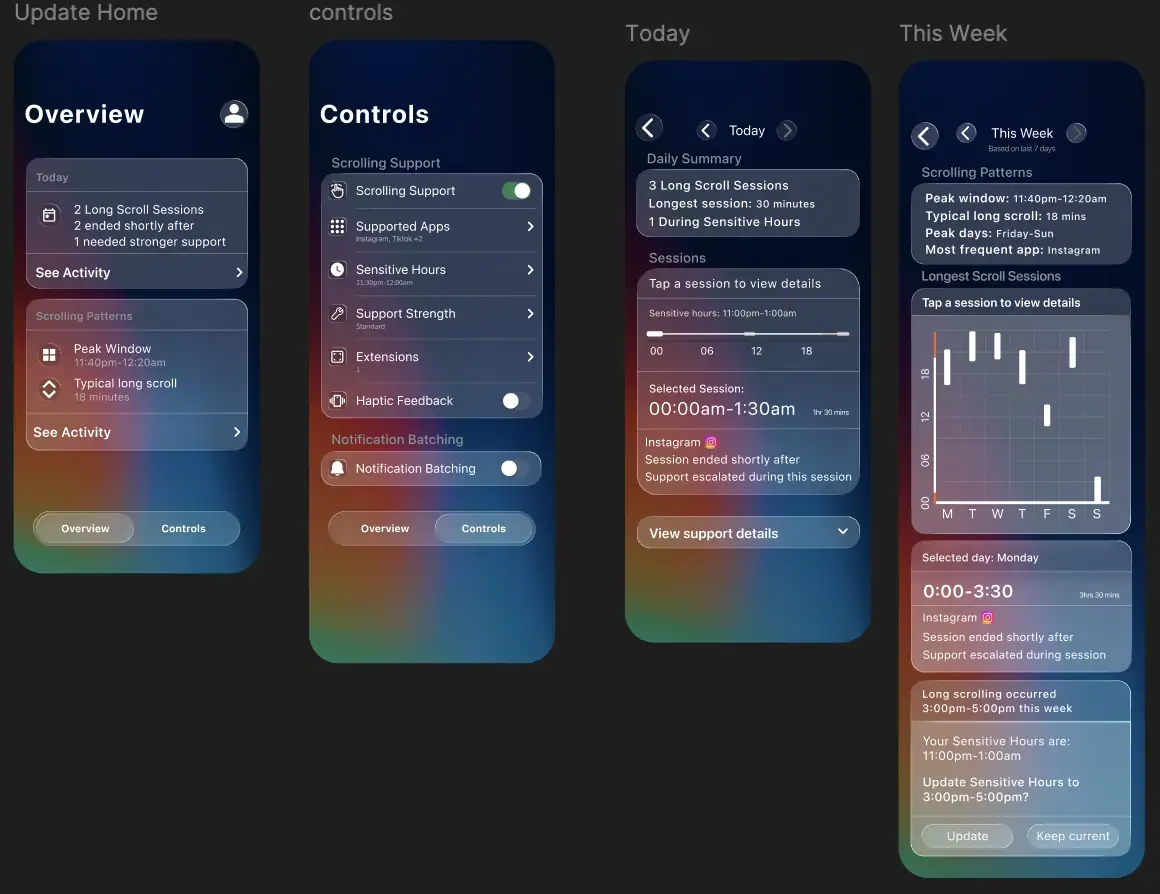
1.1The main app - Overview and Controls, with daily and weekly pattern views.02 - PROBLEM
Boundary erosion, not screen time
The problem we defined isn’t excessive screen time. It’s the combination of emotionally triggered initiation, cue-driven reinforcement and weak internal stopping mechanisms that leads to unintended continuation - mainly among young adults.
That reframing is the whole project. It moves the target from how long someone uses their phone to why the session never closes, and it changes what a solution has to do.
Who it’s for
18-28 year olds - university students and young professionals.
Heavy users of Instagram, TikTok and YouTube Shorts.
Motivated but failing - they want to cut down, and restriction tools have already let them down.
Emotionally triggered - the phone is the default response to boredom, stress and loneliness.
Time-unaware - losing track of session duration is consistent, not occasional.
03 - RESEARCH
Where the evidence came from
Secondary - behavioural evidence
Habits form through cue-response repetition in stable environments. Disrupting them needs environmental restructuring, not willpower. Wood & Neal (2007)
Salient stimuli capture attention automatically, even when irrelevant to the current goal. Notifications exploit this directly. Theeuwes (2010)
Habitual checking becomes more pervasive over time - session length and frequency rise as the behaviour automates. Oulasvirta et al. (2012)
Behaviour precedes intention. The habit loop fires before awareness does. Neal, Wood & Quinn (2006)
Dashboards alone don’t change behaviour. Showing usage statistics doesn’t produce sustained change; that needs friction, environmental restructuring and motivation alignment. Nielsen Norman Group
Primary
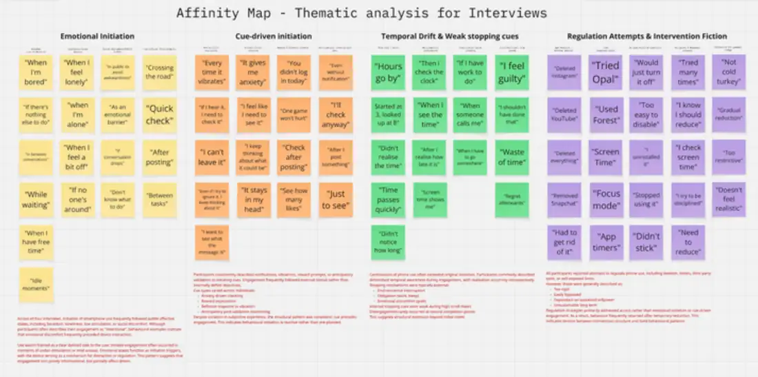
Four in-depth interviews, analysed through thematic affinity mapping.
A 20-person survey. 65% reported an hour or more on their phone after 9pm. None of the twenty found existing tools very helpful.
All four interview participants had deleted third-party restriction apps - the single finding that shaped the entire design direction.
3.1Thematic analysis of the interviews. The four columns became the structure of the problem.04 - INSIGHTS
The drift cycle
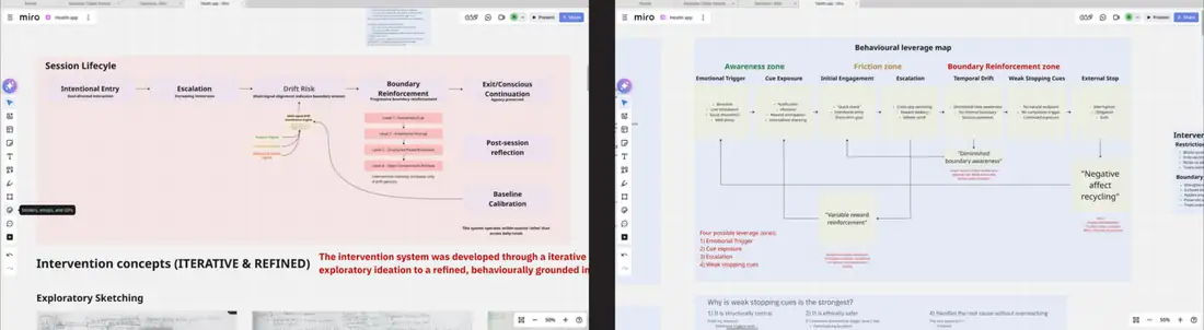
Six stages, mapped from the interview data - how an emotionally triggered start becomes an unintended two-hour session.
Temporal drift Time awareness lost · session extends
→
Weak stopping cues No natural endpoint · no completion signal
→
External stop Interruption, obligation, guilt
The insight the whole system rests on: the problem is not the initiation of phone use. It is the structural absence of stopping cues during continuation. Every existing tool intervenes at initiation, which is the one stage users defend most and the stage least responsible for the outcome.
4.1Mapping the session lifecycle to find the leverage point. Weak stopping cues won: structurally central, ethically safer, and closest to the root cause.05 - DESIGN CONCEPT
Make the invisible visible
We weren’t designing a restriction tool. We were designing a session-boundary reinforcement system that surfaces patterns users cannot currently see.
Why it looks like a system app, not a wellness app
All four interview participants had deleted third-party restriction apps. A tool that reads as native avoids the add-on stigma - it feels like part of iOS rather than something bolted on and therefore deletable. The visual language borrows deliberately:
Apple Health - layered dark surfaces, SF Pro, system type scale.
Apple Settings - grouped lists and toggle patterns.
Dynamic Island - within-session, ambient, non-interrupting.
The Dynamic Island choice matters more than it sounds. It’s the only surface on the phone that can speak during a session without leaving the app the person is in - which is exactly where a stopping cue has to land.
06 - ESCALATION MODEL
Four levels, and why we live in the first three
Existing tools jump straight to Level 4. Drift operates at Levels 1-3; Level 4 is optional and user-enabled only. That’s a direct consequence of the research - all four participants abandoned tools that felt punitive.
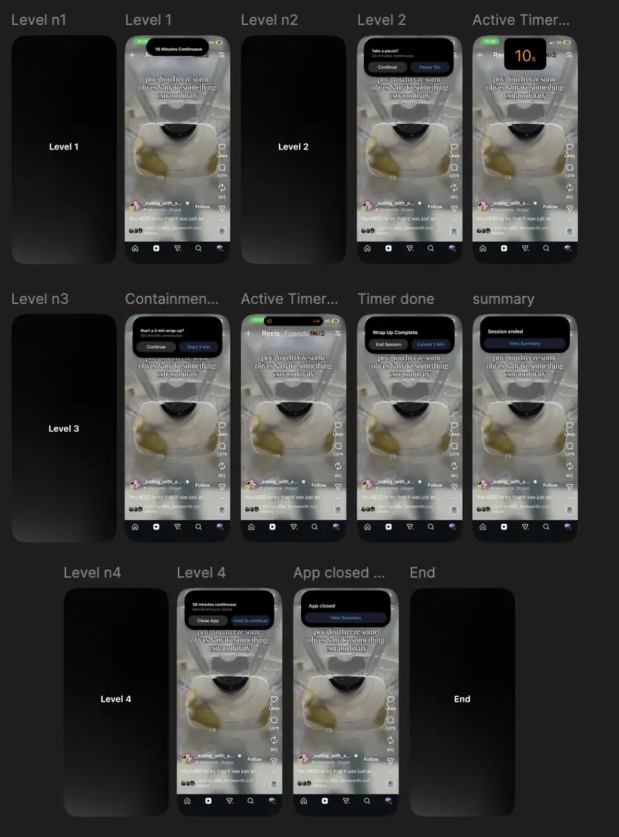
L1 - Notice. The Dynamic Island expands for one to two seconds: “18 minutes continuous.” Soft haptic, 300ms, auto-shrinks, no interaction required. Restores time consciousness without interrupting flow.
L2 - Pause. A boundary prompt: “You’ve been scrolling continuously. Continue intentionally?” Take a 10-second break, or ignore it and it collapses. Re-engages conscious decision-making.
L3 - Structure. Progressive friction. A three-minute wrap-up mode that creates a natural endpoint. The session is never blocked - completion is what ends it.
L4 - Contain. User-defined containment for the most vulnerable hours. Cannot be dismissed by tapping outside; a choice is required. Off unless the user turns it on for a window they set.
7.1Every level, in context, over the app it’s interrupting - because the intervention only makes sense against the content it’s competing with.07 - TASK ANALYSIS
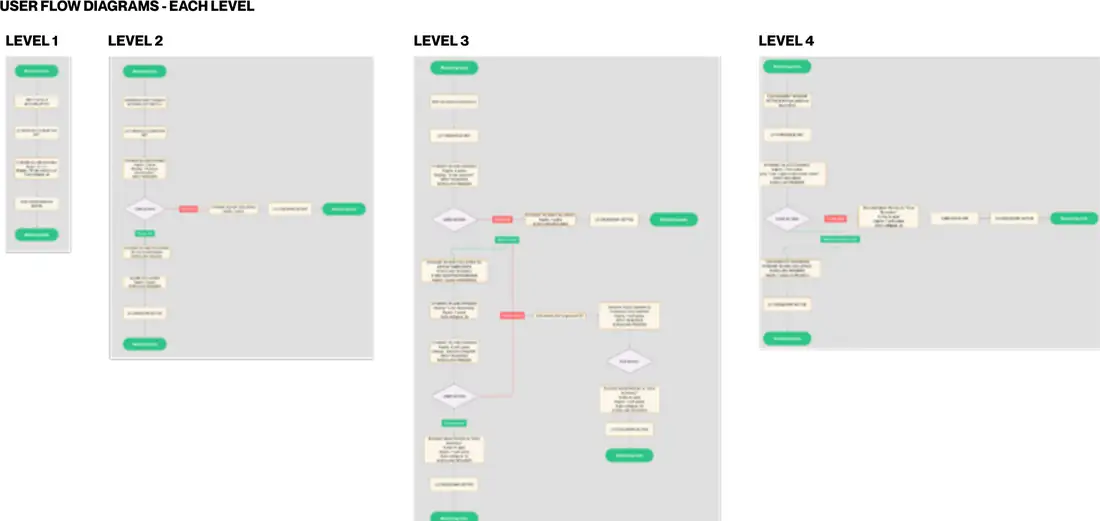
Each escalation level got its own flow diagram, because the branch logic differs at every step - what happens on ignore, on tap, on timer completion, and what conditions have to be true before the next level can fire at all.
9.1Levels 1 to 4. The complexity growth is the point - each level adds a decision the user can make, not a restriction.09 - WIREFRAMES
Sketching the interruption
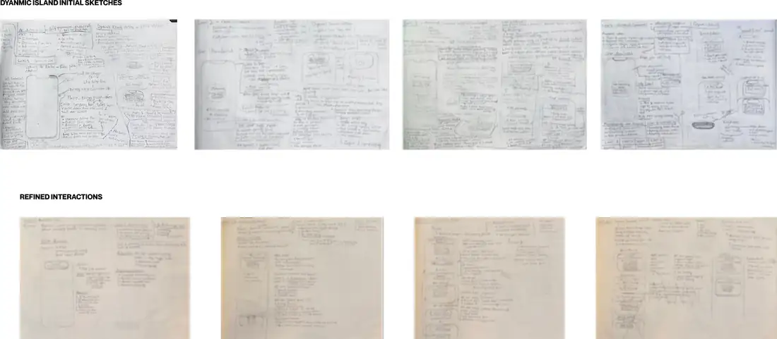
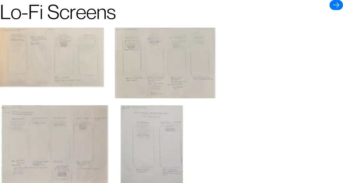
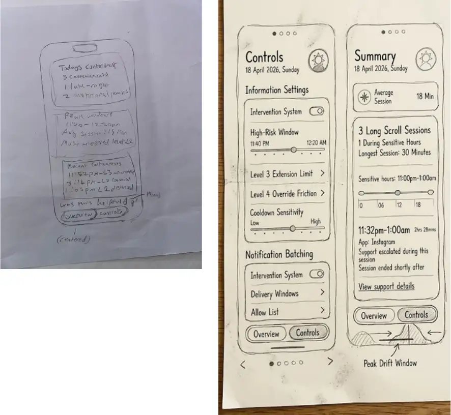
The Dynamic Island work started on paper, because the constraint is spatial before it’s visual - there are only so many words that fit in an expanded island, and the whole intervention has to survive being read in under two seconds.
10.1Initial Dynamic Island sketches, then refined interactions.
10.2Lo-fi screens used for guerrilla testing.
10.3Paper wireframes of Controls and Summary.
10 - DESIGN SYSTEM
Palette and components
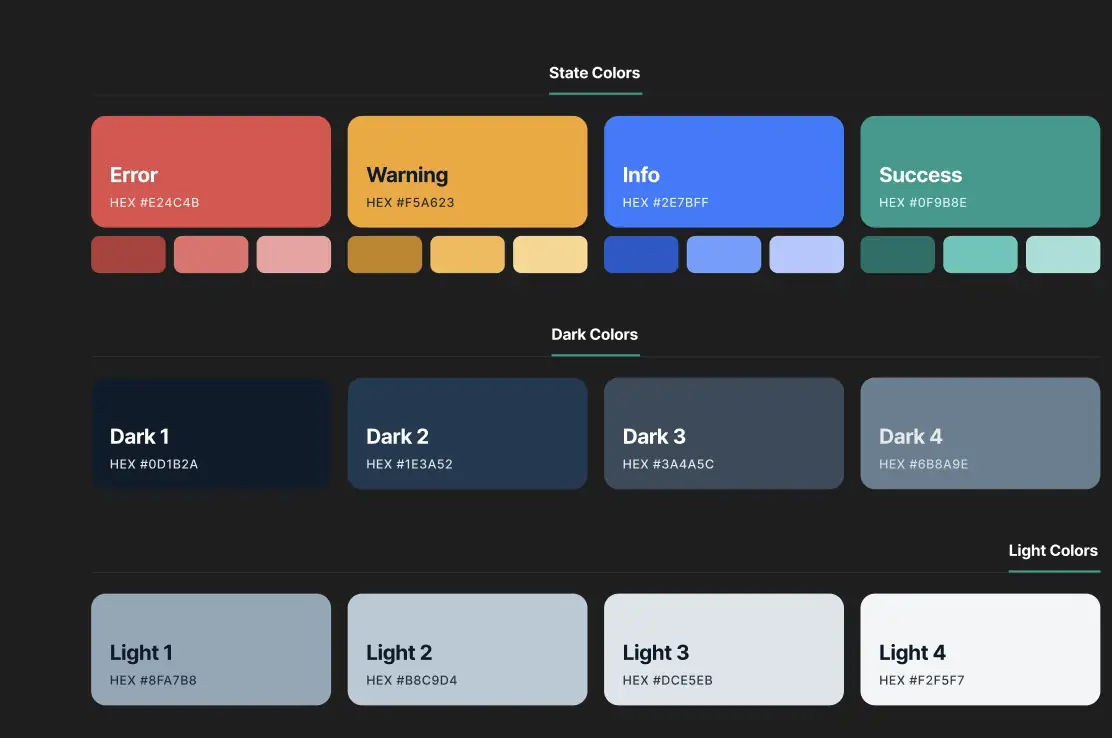
A dark system-native palette with defined state colours, four dark steps and four light steps - built so that every surface in the app is a token rather than a one-off value.
11.1State, dark and light ramps with hex values.
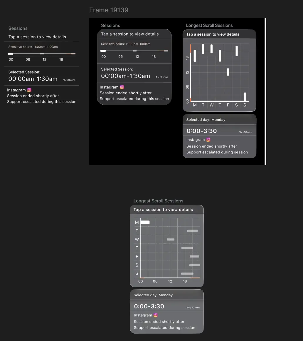
11.2The session components, built in isolation before assembly - the timeline, the weekly chart, and the selected-session panel that both feed.11 - HIGH-FIDELITY UI
The built system
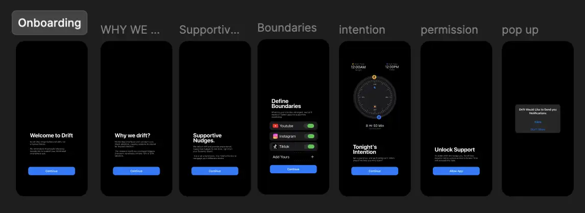
Onboarding does one job: set the expectation that this is not a hard block. P2's scenario turns on that single sentence landing before anything else.
12.1Onboarding - welcome, explanation, boundaries, intention, permission.
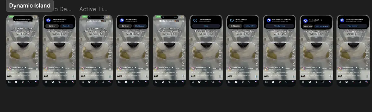
12.2The complete Dynamic Island sequence, start to session end.12 - ACCESSIBILITY
Accessibility considerations
A system that interrupts people during their most vulnerable hours has a higher duty here than most products. A WCAG 2.2 review of the delivered designs, written as acceptance criteria for build.
Built in by design
The first cue is non-visual. Level 1 pairs the Dynamic Island expansion with a 300ms haptic, so the signal reaches someone who is not looking at the top of the screen or cannot read it at a glance.
Nothing is ever blocked. Every level preserves the choice to continue, which removes the dead ends and forced errors that make restriction tools hostile to users with cognitive or attention differences.
Ignoring is a valid response. Level 2 collapses on its own if untouched. No modal traps focus, and no prompt requires interaction to dismiss.
Duration is stated, never implied. "18 minutes continuous", a visible 10-second countdown, a three-minute wrap-up: elapsed and remaining time are always numeric rather than inferred from an animation.
Level 4 cannot surprise anyone. The only level with real friction is off by default and enabled by the user for hours they choose themselves.
Escalation is gradual. Each level adds a decision rather than a restriction, which keeps cognitive load proportionate to how far a session has drifted.
To resolve before build
Dynamic Island copy sits close to the minimum legible size. It needs testing at the largest Dynamic Type settings, with a defined truncation rule when text reflows.
Promotion and session status pair a coloured dot with a word in some places and rely on colour alone in others. Every status needs its text equivalent.
The weekly scroll chart encodes duration by bar position and length only. Each bar needs an accessible value, and the view needs a table equivalent for screen-reader users.
The Level 2 screen blur is a significant visual change with no announced equivalent. It needs a live-region announcement and a stated behaviour under Reduce Motion and Reduce Transparency.
Stage labels in the weekly and daily views fall below 4.5:1 against the tinted panels at their current weight and need darkening or enlarging.
Timed interactions need a documented extension path for users who cannot respond within ten seconds, in line with WCAG 2.2 Enough Time.
Not tested with assistive technology or with disabled participants. The points above are a design review, not validation.
13 - USABILITY TESTING
Does the escalation read as support?
The thing being tested wasn’t whether people could find a button. It was whether the escalation model is understandable, behaviourally coherent, and read as supportive rather than punitive - because the research says punitive tools get deleted.
Methods: think-aloud protocol for verbalised reasoning, plus behavioural observation of navigation patterns, hesitation points and error rates.
What held up
L1 - P1 immediately read “18 minutes continuous” as time awareness, and said it would probably make him come off it. Non-intrusive; doesn’t break flow.
L2 - “Take a pause?” was clear, and the two-option structure was understood correctly. The 10-second timer concept was validated.
L3 - P1 framed the scroll freeze as supportive: it forces attention onto the prompt rather than the content. Three minutes felt appropriate; two extensions felt fair.
L4 (round 2) - “A lot better.” Close App plus a three-second hold-to-continue validated as a distinct escalation.
Controls structure - both participants validated the two-section split of Scrolling Support and Notification Batching.
Visual direction - P2 described it as an extension of iOS Settings; clean, not heavy. That was the design concept’s central bet, confirmed.
Session summary - P1 expected a summary after closing the app, which validated the View Summary approach.
What changed between rounds
Level 4 did not hold up first time. It was rebuilt as Close App plus a three-second hold-to-continue, and the second round validated it as a distinct escalation rather than a repeat of Level 3. The rest of the model carried through both rounds unchanged.
14 - ITERATIONS
What changed
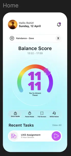
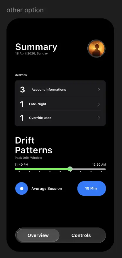
The first main-app version was closer to a conventional wellness dashboard - a light summary screen, a balance-style score, mode switches. It was legible, but it was the thing the research warned about: a dashboard, presenting statistics, which the evidence says does not change behaviour on its own.
14.1An early direction - score-led and mode-based.
14.2A darker summary variant, still dashboard-shaped.
Then
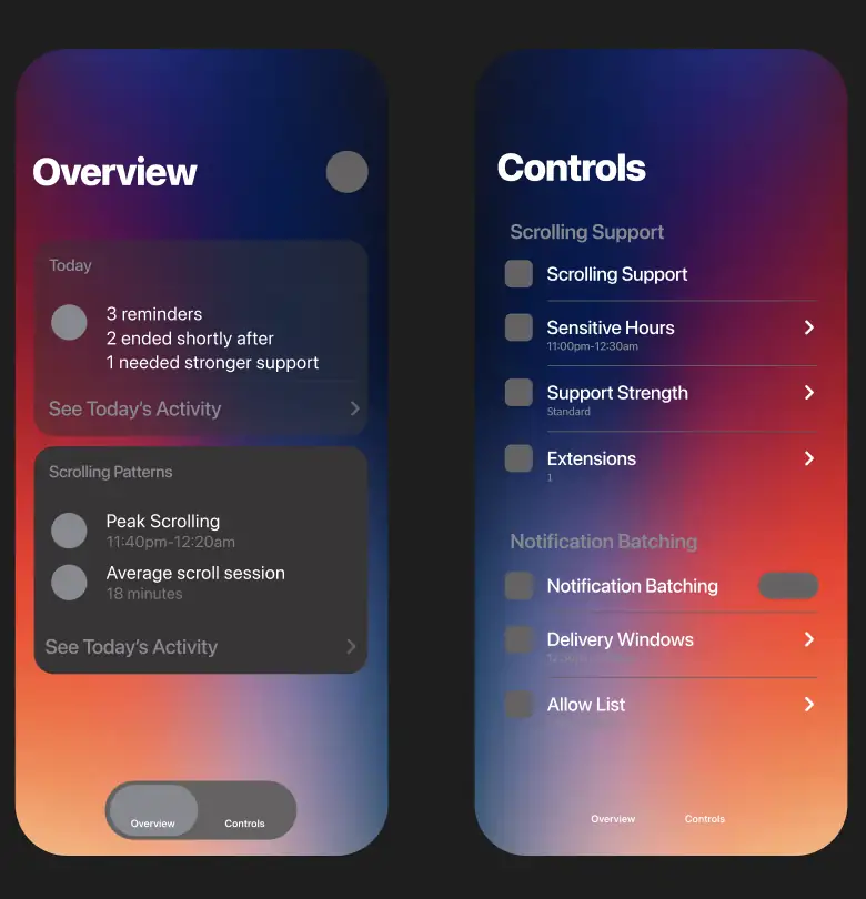
Language moved from metrics to behaviour. “Average session 18 min” became “2 long scroll sessions, 2 ended shortly after, 1 needed stronger support” - a description of what happened rather than a number to be judged by.
Controls split into two named groups - Scrolling Support and Notification Batching - which testing then validated.
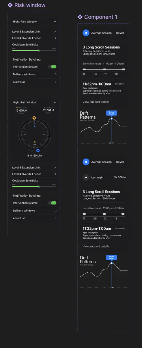
The clock-face high-risk window was replaced by a plain sensitive-hours timeline, readable at a glance.
Pattern views gained a time dimension - Today and This Week, with a weekly chart showing when long sessions actually cluster, and a prompt offering to update sensitive hours to match the real pattern.
14.3Earlier Overview and Controls.
14.4The high-risk window component, before simplification.
15 - OUTCOME
Outcome and learnings
What shipped
A complete iOS concept across three surfaces: seven onboarding screens, a two-tab main app with daily and weekly pattern views, and a full Dynamic Island escalation sequence from first notice to session summary.
A four-level escalation model with a per-level user flow, tested with participants and revised between rounds.
A tokenised dark design system with state, dark and light ramps.
Nine hypotheses verified before a single screen was sketched - every design decision traceable to a survey finding, an interview quote or a cited source.
What I’d take from it
Reframing the problem was worth more than any screen. The industry frames this as excessive screen time; the research showed it’s session-boundary erosion. Changing the problem changed the entire solution space.
Behaviour beats demographics. The persona isn’t defined by being 22 and a student - he’s defined by emotionally triggered initiation and absent stopping cues. That’s what made the design decisions fall out cleanly.
Preserving choice is a design constraint, not a nicety. The evidence was unambiguous that restriction triggers resistance and abandonment, so every level had to leave the decision with the user.
Hardest parts
Avoiding time-based design logic - the obvious solution is a timer, and the research says a timer is the thing people delete.
Making each escalation level meaningfully distinct in testing rather than four versions of the same prompt.
Preserving autonomy while friction increases.
Keeping research-to-design traceability across every iteration decision.
MakeAssure is a B2B marketplace website. Buyers come to find a local seller they can trust.
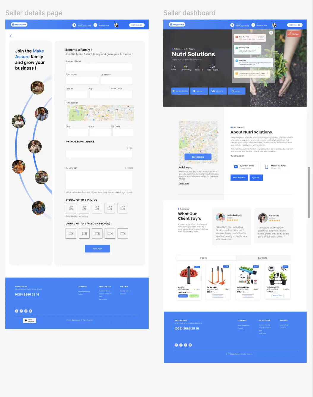
My main challenge was deciding where both audiences could share a system - the header, product cards, ratings - and where they needed to split, which turned out to be everything after sign-up.
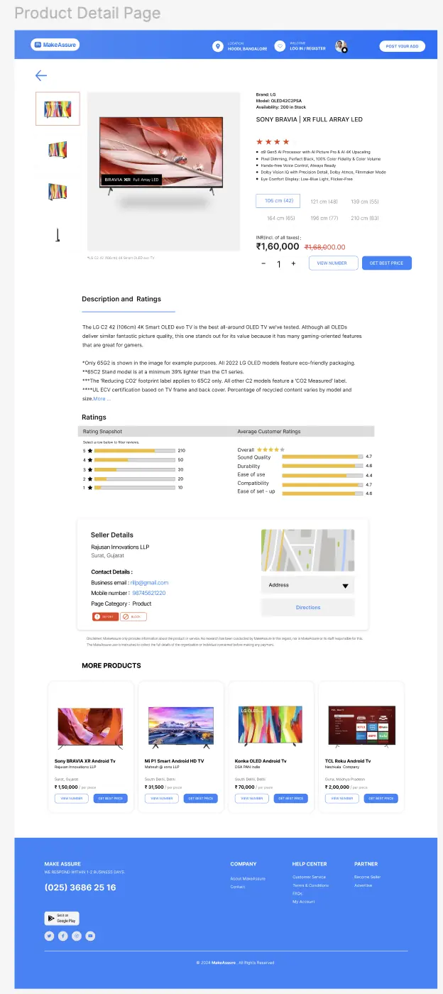
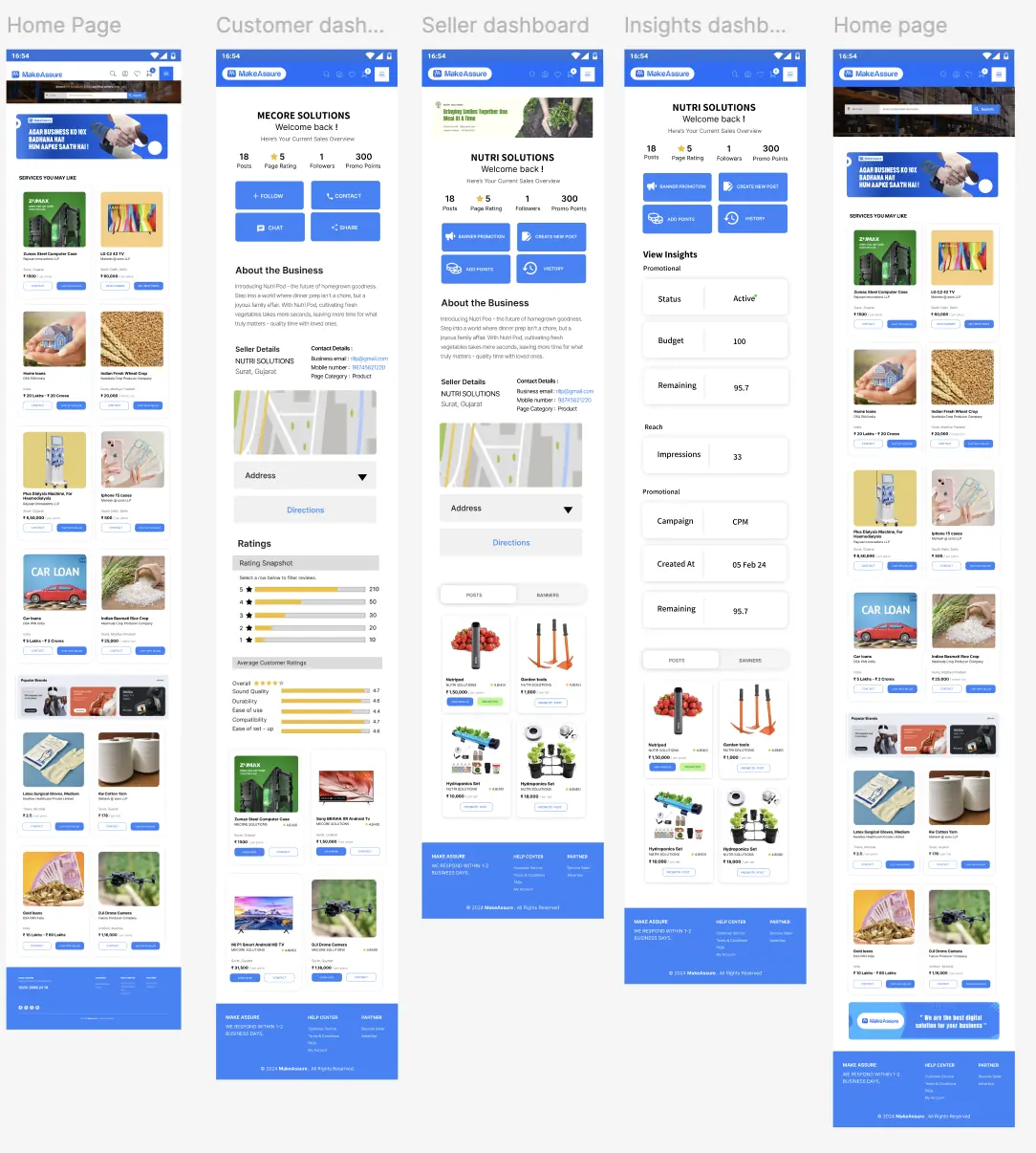
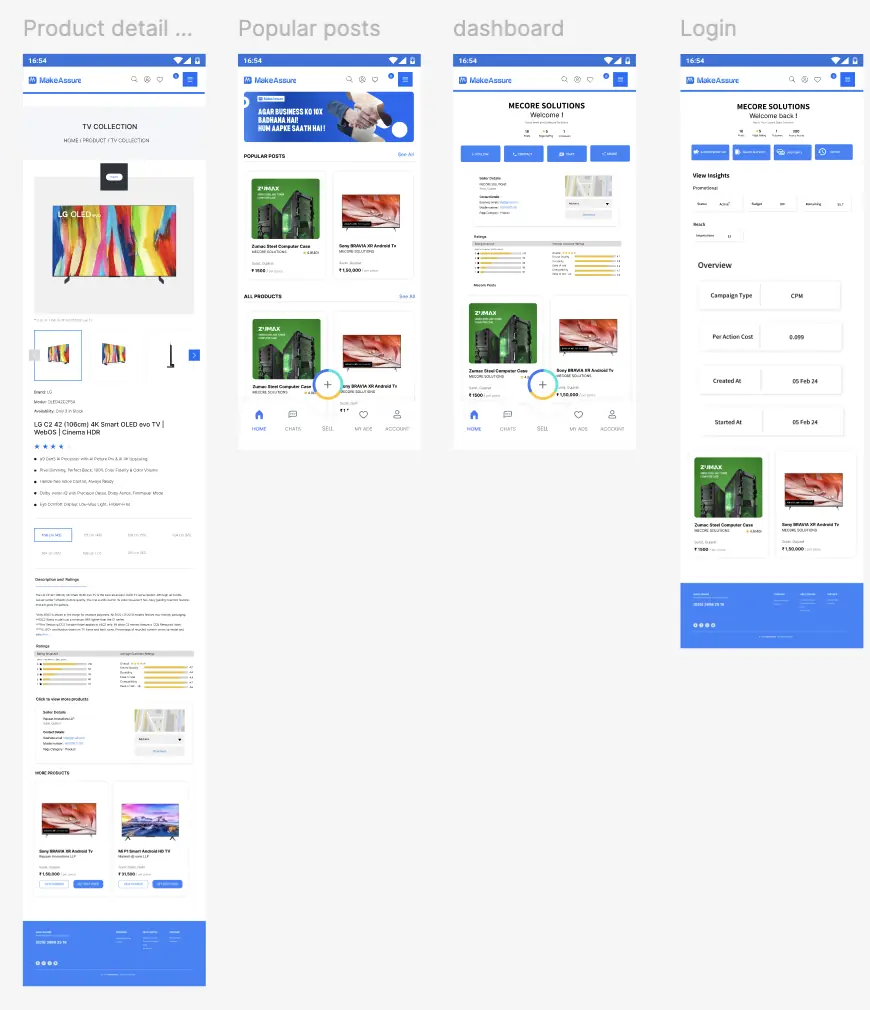
I designed the full journey: sign-up and OTP verification, marketplace browsing, product pages with ratings and seller details, customer and seller dashboards, listing creation, paid promotion and referral credit, all as responsive web and native mobile screens.
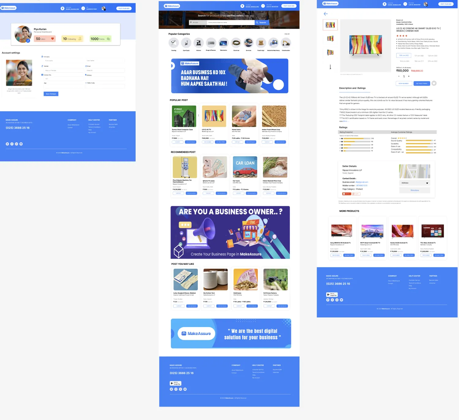
1.1The three surfaces a buyer moves through: account, marketplace home, product detail.02 - PROBLEM
The problem
Four pressures shaped the interface, each visible in how the screens allocate space:
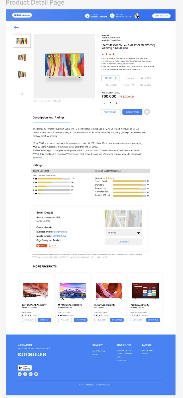
Trust. Buyers need to know a seller is real before they call. The product detail page gives roughly a third of its space to seller details, ratings breakdown and a report/block control.
Proximity. Location sits in the header on every screen, and the home page search pairs a location filter with the product query.
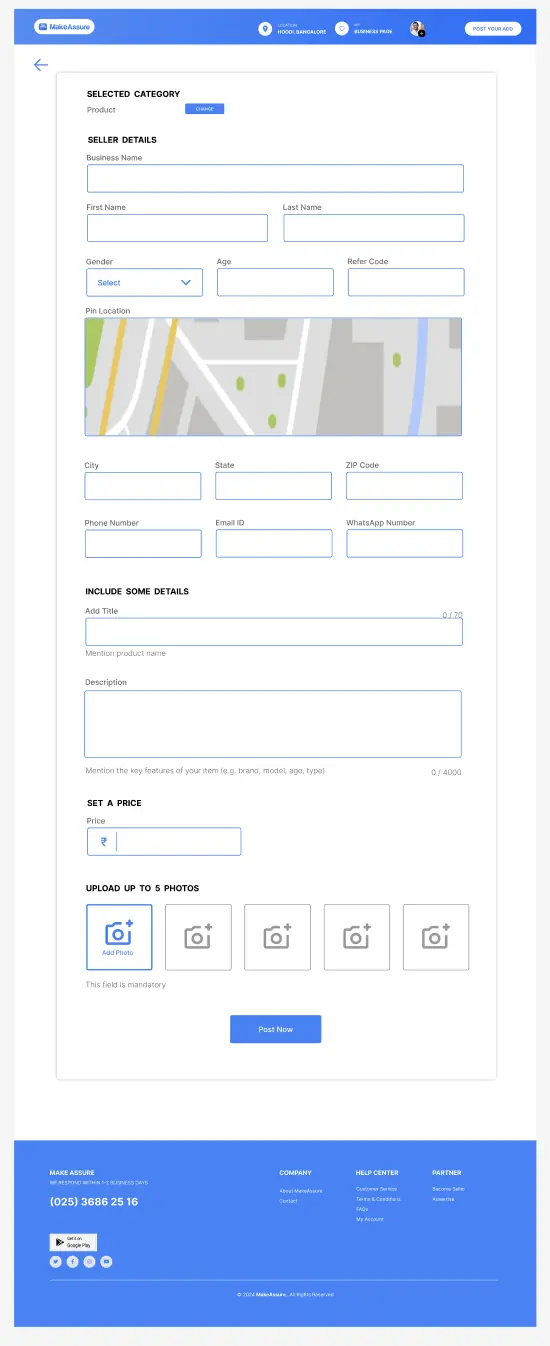
Effort of listing. A seller has to be able to post a product with photos, price and description in a single uninterrupted form.
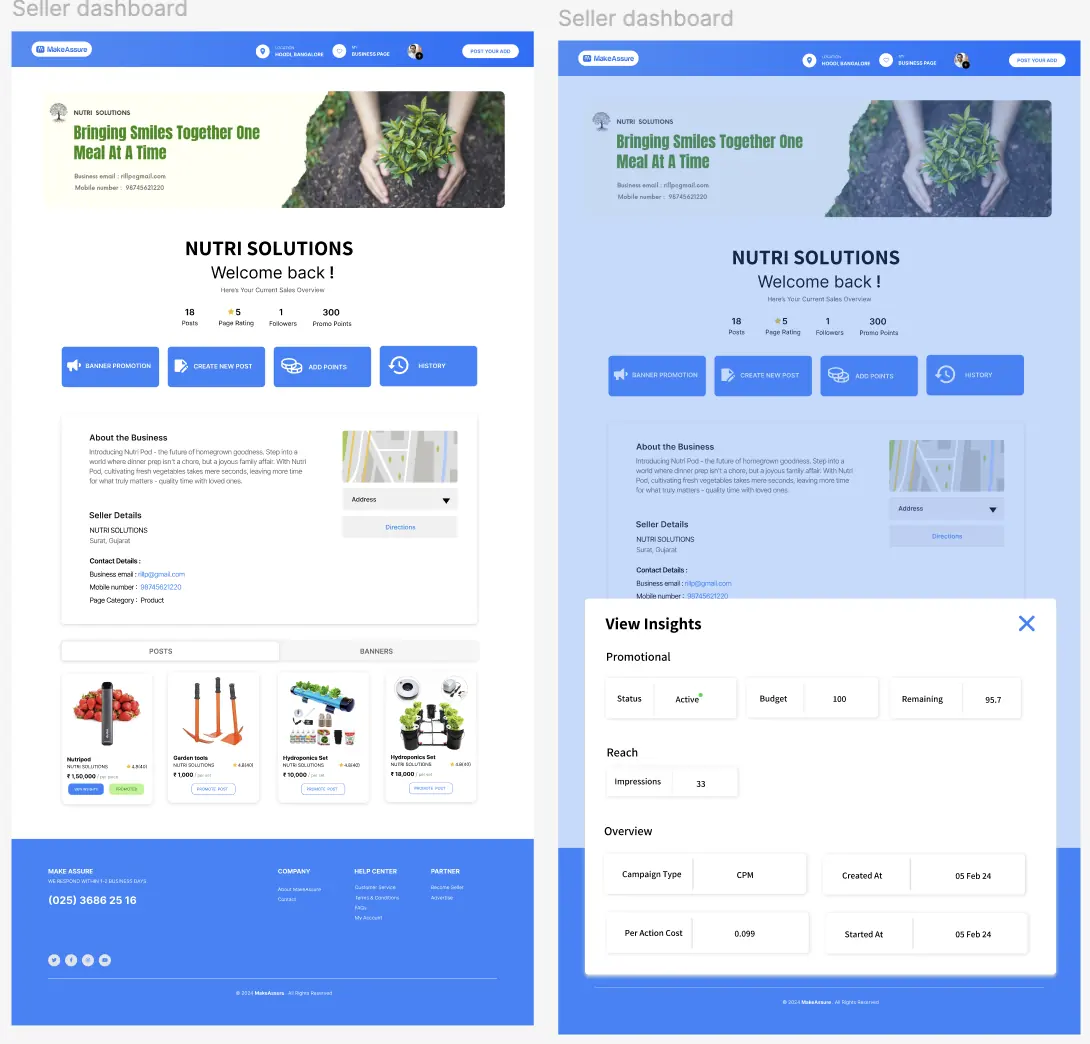
Proof it worked. Sellers who pay to promote need reach, spend and remaining budget visible without asking anyone.
03 - PERSONAS
Two audiences, one platform
The product splits its users at the first screen: sign-up asks you to choose seller or customer before anything else, and the two paths never fully rejoin. Everything downstream - dashboard, permissions, primary action - follows from that choice.
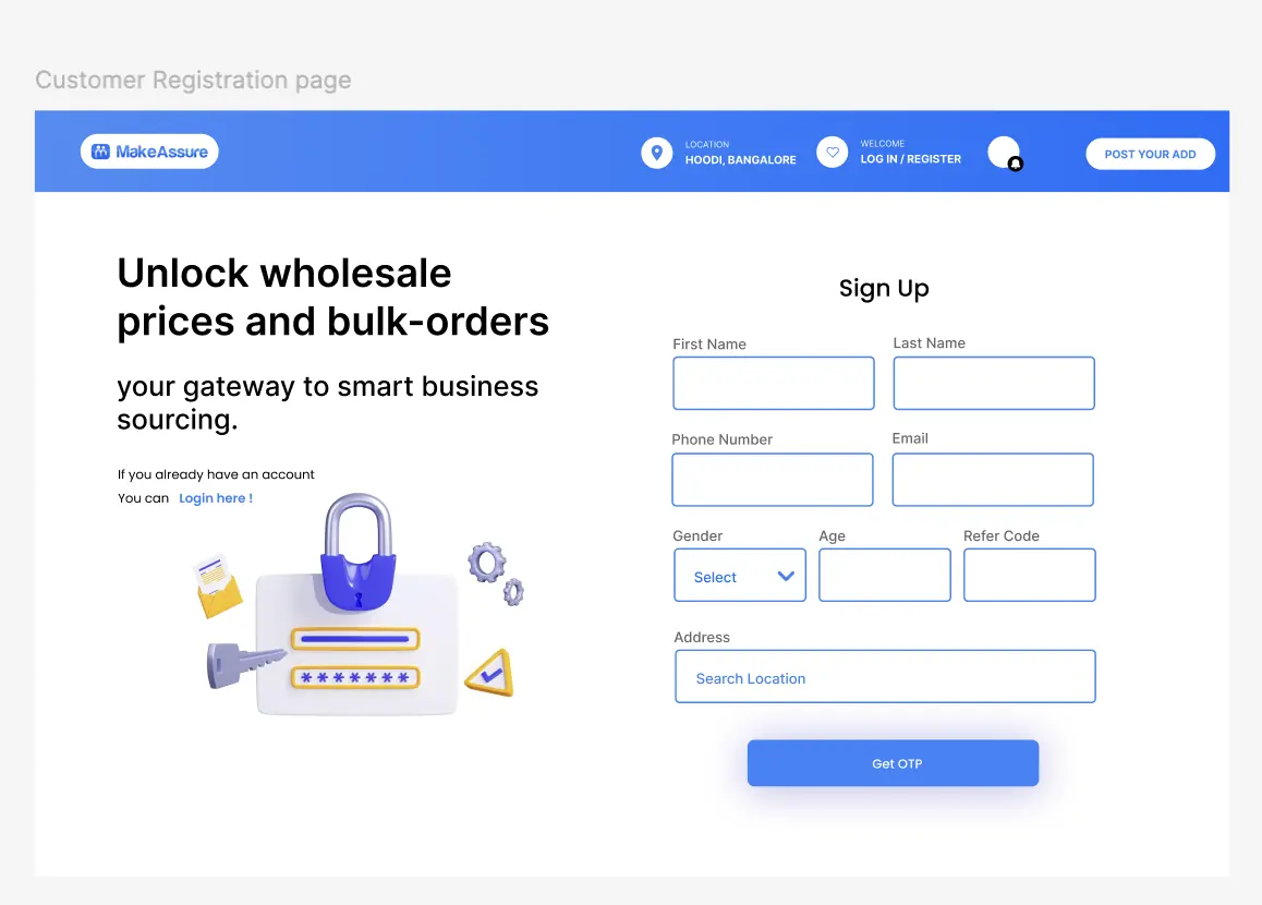
5.1Customer sign-up leads with the value of an account.
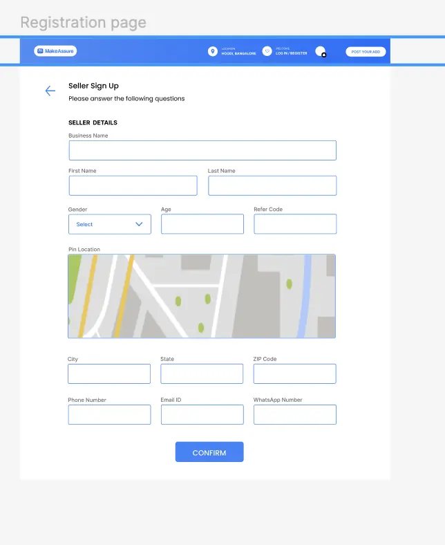
5.2Seller sign-up asks for more, including a pinned location.
04 - USER JOURNEY
Scenarios the interface supports
Two scenarios account for almost all traffic on a marketplace, and the design resolves both end to end.
Buyer sourcing a product
Lands on home, sets location in the header, searches by product or service name.
Scans category tiles or the popular / recommended / suggested post rails.
Opens a product: images, specifications, size options, price against a struck-through original, availability.
Checks the ratings snapshot and the per-attribute customer ratings before committing.
Reveals the seller’s number, requests a best price, or chats - and can report or block the seller from the same block.
Seller listing and promoting
Signs up as a seller, pins a location, confirms by OTP.
Posts an ad: category, seller details, title, description, price, up to five photos.
Returns to the dashboard to see posts, page rating, followers and promo points.
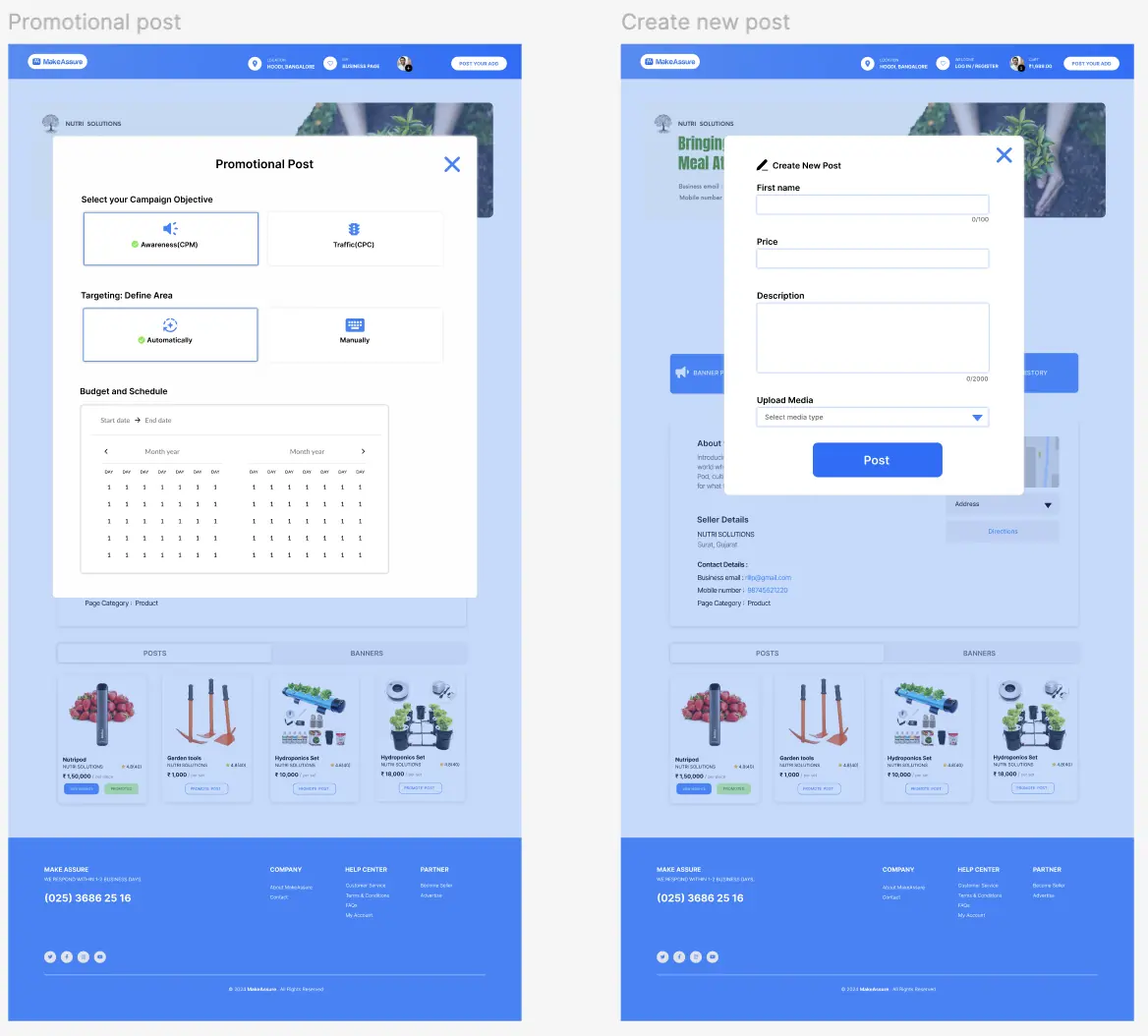
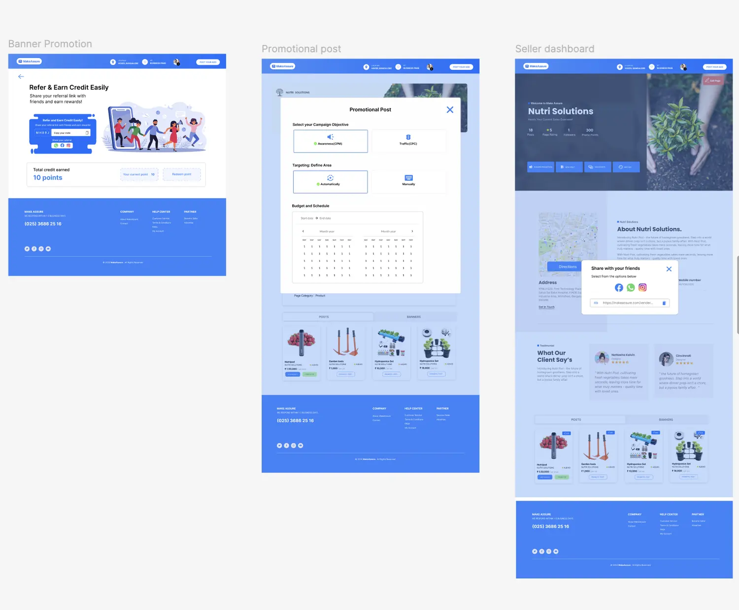
Promotes a post - picks an objective, targeting and budget against a date range.
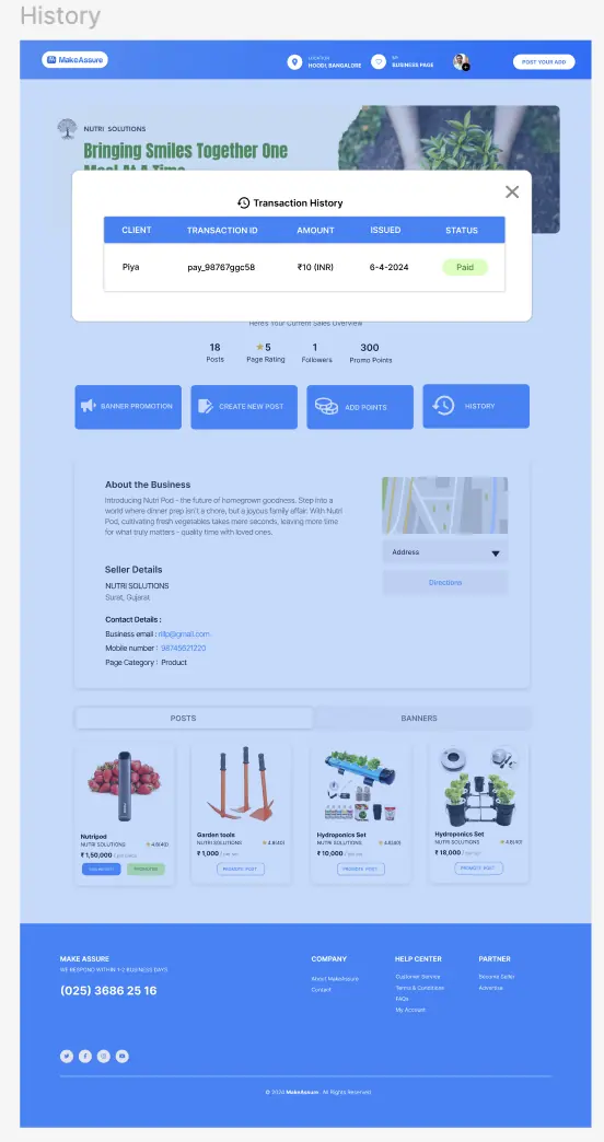
Opens insights to see status, budget, remaining spend and impressions; checks transaction history.
05 - INFORMATION ARCHITECTURE
How the platform is organised
A persistent header carries the four things that never stop being relevant - brand, location, business page, account - plus the primary action, Post your ad, which is the only button given a filled pill on the whole header. On mobile that same hierarchy becomes a five-item tab bar.
Global header
Logo
Location
My business page
Account / log in · register
Cart
Post your ad
Home
Search with location filter
Popular categories
Promotional banner
Popular posts
Recommended posts
Posts you may like
Popular brands
Product detail
Image gallery with thumbnails
Brand, model, availability
Size / variant options
Price and quantity
View number, Get best price, Save
Description and ratings
Rating snapshot and attribute ratings
Seller details with map and directions
Report · Block
More products
Seller dashboard
Business page banner
Posts, page rating, followers, promo points
Banner promotion, Create new post, Add points, History
About the business
Seller and contact details with map
Posts / Banners tabs
View insights
Customer dashboard
Business identity and stats
Follow, Contact, Chat, Share
Customer details with map
Ratings
Posts grid
Mobile tab bar
Home
Chats
Sell
My ads
Account
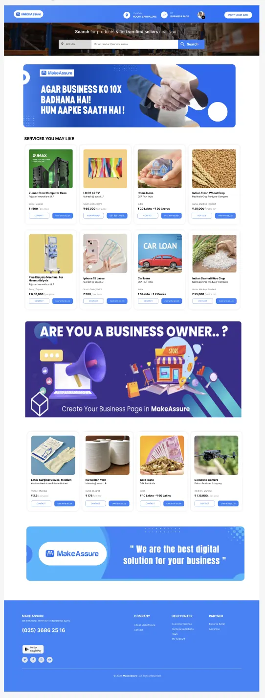
7.1Home page - the browse rails alternate with full-width promotional banners, which is also where the platform’s ad inventory lives.06 - USER FLOW
Account creation and posting
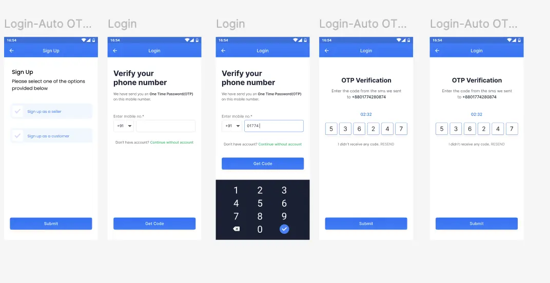
Sign-up carries the whole product’s split, so it had to be the shortest possible route to the right dashboard. Phone-first with an auto-read OTP keeps typing to a minimum on mobile, and an explicit Continue without account link means browsing is never gated.
Open app
→
Sign up
→
Seller or customer
→
Verify phone
→
OTP (auto-read, resend)
→
Details + pin location
→
Dashboard
8.1Sign-up to verified account in five screens, with a visible countdown and a resend route out of the dead end.
8.2Listing creation is one continuous form with sectioned headings, character counters and a stated mandatory field, rather than a multi-step wizard.07 - DESIGN DEVELOPMENT
Building the visual system
The system is deliberately plain, because the content it carries - product photography from thousands of unrelated sellers - is not. A single royal blue does the work of brand, primary action and link; everything structural is white cards on a light grey field with thin blue-tinted borders.
One accent, three jobs. Filled blue for primary actions, outlined blue for secondary, blue text for links and contact details. Rating stars are the only other colour, in amber, so they read as data rather than as another button.
Cards as the unit. Every listing is the same card - image, title, seller, location, price, two actions - so the home rails, the seller’s post grid and the “more products” rail are all one component.
Forms with visible edges. Inputs are outlined rather than filled, with the label sitting above and outside, and counters on anything length-limited.
Dialogs for anything with a cost. Promotion, post creation, insights and transaction history all open as modals over the dashboard, so a seller never loses the context of the page they’re changing.
10.1The two dialogs that generate the platform’s content and its revenue, sharing one layout, one selection pattern and one primary button.08 - HIGH-FIDELITY UI
The screens
Product detail is the page that has to close the loop between browsing and contacting, so it stacks specification, price, social proof and seller identity in that order and repeats the contact action at the point where confidence peaks.
11.1Product detail - seller identity is treated as part of the product, not a footnote.
11.2The same template holding different inventory - the test of whether a layout is a component.
11.3Seller dashboard and its insights dialog: status, budget, remaining and impressions in plain labelled pairs.
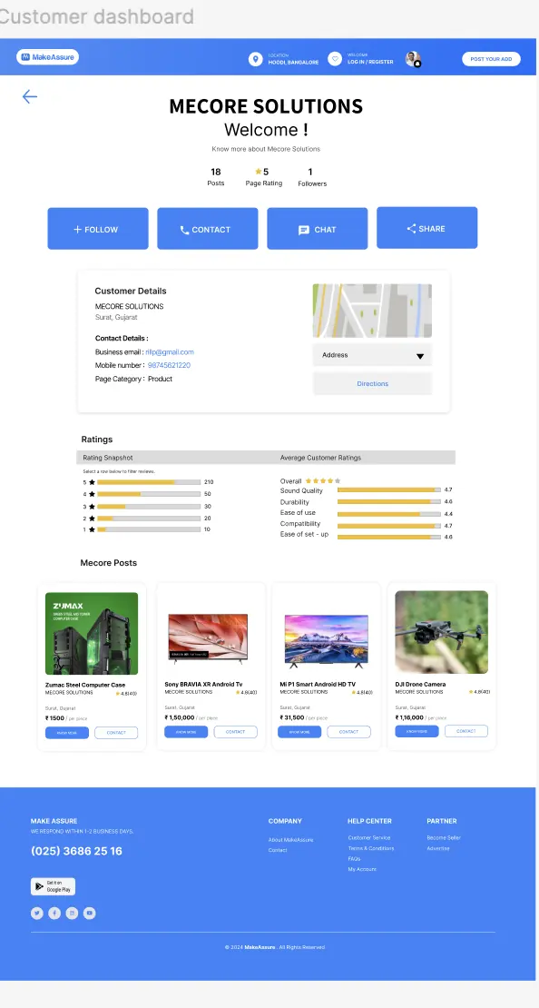
11.4Customer dashboard - four equal actions, because there is no single obvious next step.
11.5Transaction history - status carried by a chip as well as a word.
11.6Mobile is a re-layout, not a squeeze: listings drop to two columns, dashboard stats become a single row, and insights stack as full-width label-value rows.
11.7The floating add button keeps posting one tap away from any feed screen.09 - ACCESSIBILITY
Accessibility considerations
A WCAG 2.2 review of the delivered designs, written as acceptance criteria for the build team rather than as commentary.
Holding up
Every form field has a visible label positioned outside the input, so it survives being filled - no placeholder-only labelling.
Character counters and the mandatory-field note give the user the constraint before they hit it, not after submission.
The OTP screen shows a countdown and a resend route, so a delayed message isn’t a dead end.
Status is never colour alone - the Paid chip carries the word, and promotion status pairs a dot with the label.
Touch targets on the mobile tab bar and the primary buttons are generously sized.
To fix before build
The light-blue page states put mid-blue text on a tinted blue field; those pairs need re-checking against 4.5:1 for body text and 3:1 for UI components.
Grey caption text on the product detail page (disclaimer, small print) is the lowest-contrast type in the system and should be darkened rather than shrunk further.
Amber rating bars need a non-colour equivalent - the numeric value beside each bar covers this, so it must not be dropped on mobile.
Dialogs need a defined focus trap, an initial focus target, Escape to dismiss and focus returned to the trigger; the visual design already gives each one a clear close control.
The map blocks need a text address and a keyboard-reachable directions link - which the later dashboard version adds.
10 - ITERATIONS
What changed between versions
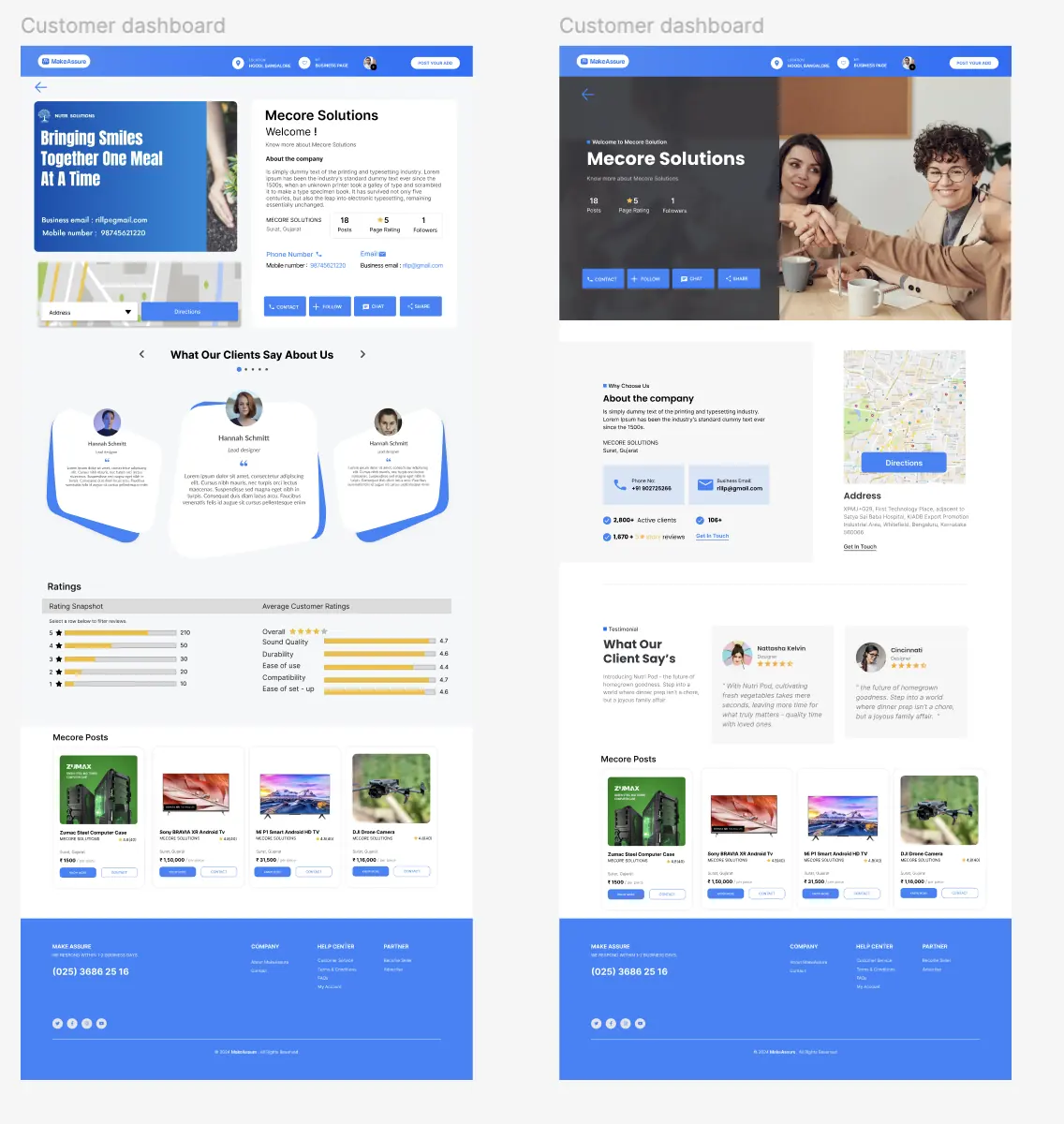
Both dashboards were rebuilt after review. Each comparison below sets the two versions against each other and states what moved.
Customer dashboard
The split banner-and-text card became a full-bleed hero with the business name over a photograph - the page now opens with the business rather than with a layout.
Contact details moved out of a paragraph into labelled phone and email cards with icons.
The floating testimonial carousel, which competed with the ratings block for the same job, was replaced by two static quote cards next to a section heading.
The map gained a full written address and a “get in touch” link instead of relying on the map control alone.
14.1Customer dashboard, version one and version two.
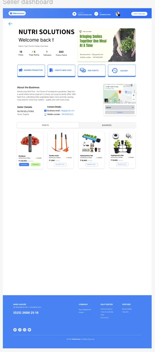
Seller dashboard
The early version stacked a banner card, then the business name, then the stats, then the actions - four separate blocks before anything actionable. The later version merges them into one hero.
Notifications were introduced as a stacked, dismissible group inside the hero, with each message carrying its own recovery action.
Sharing moved from an implied action to an explicit popover with channels and a copyable link.
An “edit page” control was added at the top right, so the seller’s most common maintenance job stopped being buried.
14.2Version one - correct, but front-loaded with four separate blocks.
14.3Version two - one hero, with notifications and page editing brought up into it.
11 - FINAL SOLUTION
Where it landed
The finished system gives a seller one page that answers four questions in order: who am I to a visitor, what needs my attention, what am I selling, and is promotion working. Growth features - referral credit, banner promotion, sharing - sit inside that page rather than in a separate marketing area, because they’re only useful in the context of a shop that already exists.
15.1Referral credit, paid promotion and sharing - the three growth loops, each reachable from the dashboard.12 - OUTCOME
Outcome and learnings
What shipped
A complete two-sided design: sign-up and OTP verification for both account types, marketplace browse, product detail, customer dashboard, seller dashboard with insights, listing creation, paid promotion, referral credit and transaction history.
Designed twice over for responsive web and for native Android and iOS, including a five-item mobile tab bar and a re-laid-out mobile home, dashboard and insights view - not a scaled-down desktop.
One component set carrying the whole marketplace: a single product card used across the home rails, the seller’s post grid and the related-products rail, and one dialog pattern for every action that costs money.
Both dashboards restructured after review - the case study above shows version one and version two side by side, and states what moved and why.
An accessibility review of the delivered screens against WCAG 2.2, handed over as build criteria rather than as comments.
The numbers to add
The delivered work is a complete two-sided system rather than a set of screens: a shared component layer, two divergent dashboards, and a promotion flow that carries the platform's revenue model.
What I learned
A shared interface for two audiences is usually two interfaces wearing one coat. The header, the product card and the rating pattern genuinely belong to both a buyer and a seller. Almost nothing past sign-up does. Trying to hold the two together longer than the sign-up screen would have cost both of them clarity.
Correct is not the same as usable. The first seller dashboard had every element it needed and still asked a seller to read four separate blocks before reaching an action. The fix wasn’t new content, it was merging what was already there into one hero. That’s the change I’d make earlier next time.
Accessibility findings arrive too late as review notes. The contrast pairs and dialog focus behaviour in section 12 were all knowable while the screens were being laid out. Writing them as acceptance criteria at the start would have cost nothing and removed a rework pass.
NEXT
Makeovers by Kiran Kaushik - bridal beauty, five pages
A five-page site for a bridal makeup artist in Gurgaon, built to turn people who found her on Instagram into confirmed, paid bookings.
MY ROLE
UI & web design - page design, booking flow and content structure
DELIVERABLES
Home, About, Services, Book Online and Contact - desktop designs at 1920
SECTOR
Bridal beauty, service business, local
SCOPE OF DELIVERY
Five desktop page designs at 1920, delivered as a complete set
01 - OVERVIEW
A portfolio that has to sell
Kiran Kaushik is a bridal and beauty makeup artist working from her studio and on location. Her clients are making an emotional, expensive, once-in-a-lifetime decision, so trust became the entire conversion problem I had to solve.
The site needed to be two things at once: a portfolio where the photography is vast and uninterrupted, and a booking system that settles the practical details before anyone picks up the phone. I gave the work the top of every page and the booking a page of its own, then designed around the pressures that make or break a booking.
To prevent disputes after the fact, clear terms sit directly beneath the form. And to prove the standard, named product brands, screen and NGO credits and client praise all appear well before anyone is asked to commit.
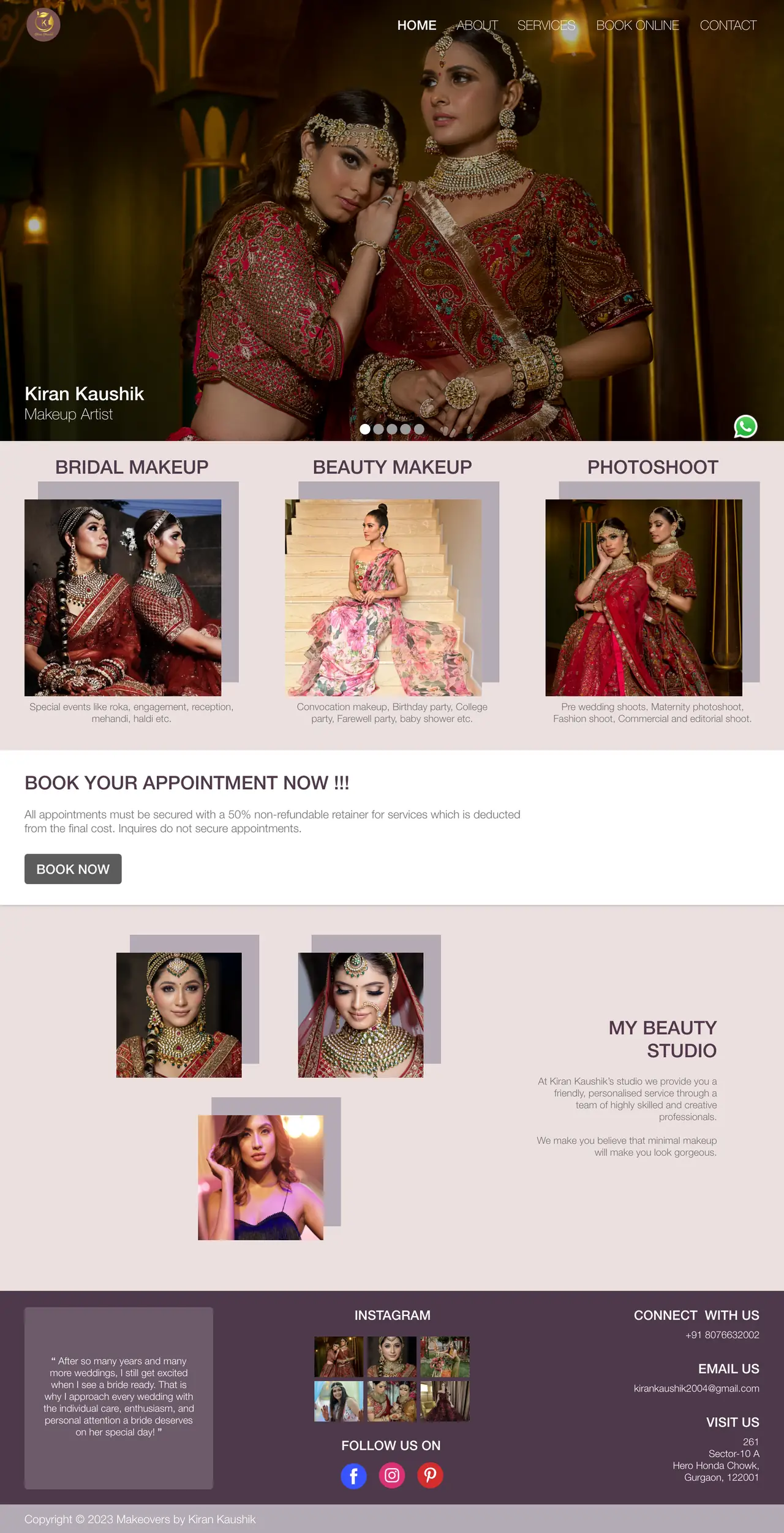
1.1Home page - photography first, then services, then the booking ask.02 - THE BRIEF
The problem
Four commercial pressures shaped the design, each answered somewhere in the five pages:
Enquiries that aren’t bookings. The booking page states it plainly - a 50% non-refundable retainer secures the date, and an enquiry on its own doesn’t.
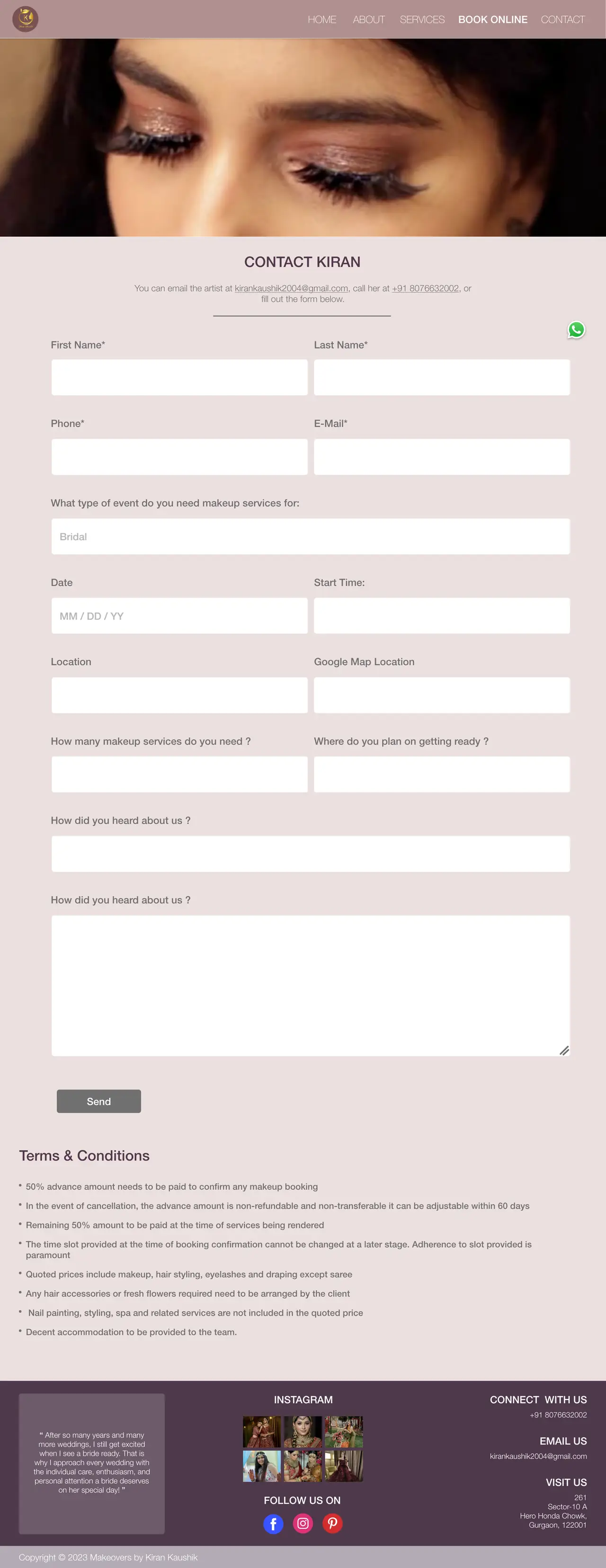
Missing details. The form collects event type, date, start time, location, how many people need makeup and where they’ll be getting ready, so the first reply can be a quote rather than a question.
Disputes after the fact. Terms and conditions sit directly under the form: what the price includes, what the client arranges, what happens on cancellation.
Proving the standard. Named product brands, screen and NGO credits, and client praise all appear before anyone is asked to commit.
03 - AUDIENCE
Who this is for
The service list splits the audience three ways, and the design keeps those splits visible from the first screen: brides and wedding parties, beauty clients booking a single occasion, and shoots - pre-wedding, maternity, fashion, commercial and editorial.
04 - INFORMATION ARCHITECTURE
Five pages, one job each
A flat structure with no sub-pages: everything is one click from the header, and the header stays in the same place on all five. Contact and Book Online are deliberately separate - one is a question, the other is a commitment.
Home
Full-bleed photo slider with name and role
Bridal makeup, Beauty makeup, Photoshoot
Book your appointment, with the retainer terms
My Beauty Studio
Footer: Instagram grid, phone, email, address
About
Portrait and personal introduction
Screen, NGO and commercial credits
Praises - client testimonials
Services
Why should you hire us
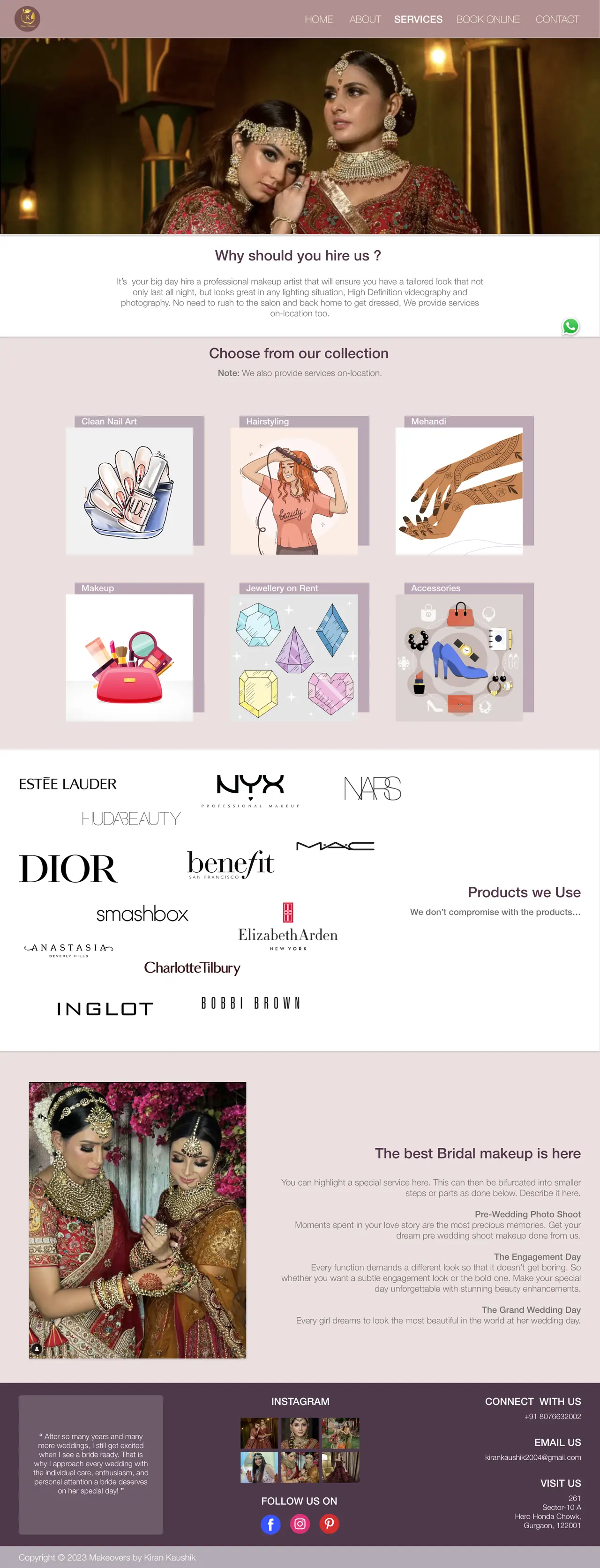
Collection: nail art, hairstyling, mehandi, makeup, jewellery on rent, accessories
Products we use
Bridal breakdown: pre-wedding shoot, engagement, wedding day
Book Online
Direct email and phone
Full booking form
Terms & conditions
Contact
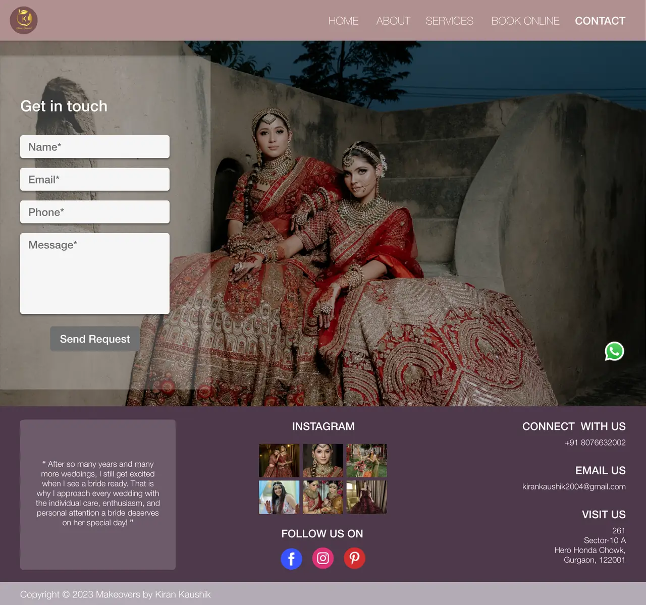
Short four-field enquiry form over a photograph
Persistent
Header navigation
Floating WhatsApp button
Footer
05 - BOOKING FLOW
Two doors, two levels of commitment
Someone who is ready to book and someone who is still deciding need different amounts of friction, so they get different forms.
Home - see the work
→
Services - see what’s included
→
Ready: Book Online
→
Event, date, time, location, headcount
→
Terms & 50% retainer
Any page
→
Still deciding: Contact or WhatsApp
→
Name, email, phone, message
6.1Book Online - twelve fields, because a quote can’t be written without them.
6.2Contact - four fields, set into the photograph rather than on a page of its own.
06 - VISUAL IDENTITY
Gold, blush and plum
The palette gets out of the way of the photography, which is red, gold and heavily embroidered on every page. Nothing in the interface competes with it.
Dusty rose header, blush page, plum footer. The page darkens as you scroll, so the footer reads as a base rather than an afterthought, and headings in the same plum tie the two ends together.
One repeated device. Every photograph sits on an offset lavender-grey rectangle. It’s the only decorative element on the site, and using it everywhere - service cards, studio shots, the About portrait, the testimonial panel - is what makes five pages feel like one site.
Gold reserved for the mark. The monogram is the only gold on the page, so it stays the brand signature instead of becoming a colour scheme.
Type does one job. A single light grotesque throughout, with size and colour carrying the hierarchy rather than a second typeface.
7.1Services - the offset-rectangle device applied across a six-card grid.07 - THE PAGES
About
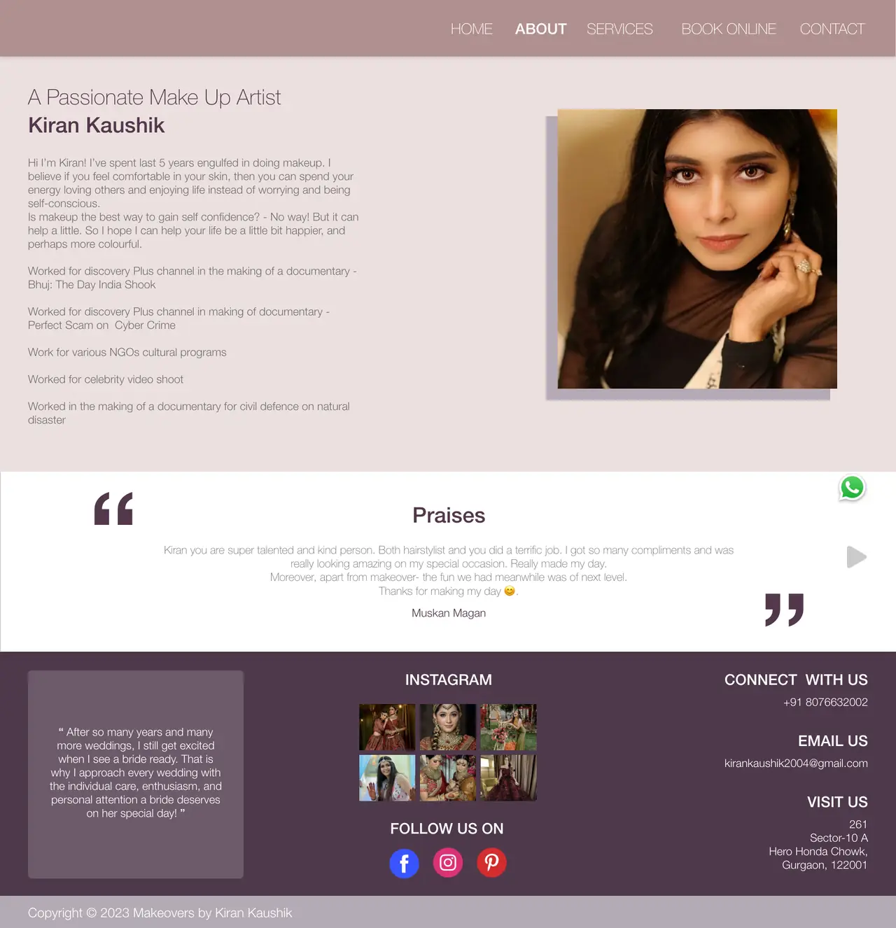
The About page is the one place where the artist, not the work, is the subject. It runs her introduction in her own voice against a single portrait, then lists credits - Discovery Plus documentaries, NGO cultural programmes, a celebrity video shoot - as plain lines rather than logos, and closes with a testimonial carousel.
8.1About - introduction, credits, then proof from a client.08 - BUILDING TRUST
Four kinds of proof
For a service booked once, at high cost, on a date that can’t be moved, trust is the whole conversion problem. The site answers it four separate ways rather than leaning on one.
The work itself - full-bleed photography on every page, and a live Instagram grid in the footer that keeps the evidence current without anyone updating the site.
The products - a wall of named brands on the Services page, so “we don’t compromise” is backed by something checkable.
The credits - documentary, NGO and commercial work listed on About.
The clients - a signed testimonial in the About carousel, and Kiran’s own line about brides repeated in the footer of every page.
09 - ACCESSIBILITY
Accessibility notes
A WCAG 2.2 review of the delivered designs: what holds up, and what I would correct before build.
Holding up
Every form field has a visible label above the input, and required fields are marked.
The commercial terms are stated in text on the page rather than hidden behind a link or a checkbox.
Phone and email appear as text in the footer of every page, not only inside a form.
Navigation stays in the same position and order on all five pages.
To fix before build
Light grey body text on the blush background is the weakest contrast on the site. Darkening it to the plum used in headings fixes it without touching the palette.
The home navigation sits white on photography with no scrim - legibility depends on which slide is showing. A gradient behind the header makes it reliable.
Several body paragraphs are right-aligned. It suits the short studio blurb, but the longer service copy should be left-aligned so each line starts in the same place.
The event-type field shows “Bridal” as grey placeholder text, so an untouched field looks answered. It should be a select with a real default, or an empty field with the example in the label.
Two fields on the booking form carry the same label, “How did you heard about us?” - one needs renaming to match what it collects, and the wording corrected to “How did you hear about us?”
The hero slider needs a pause control, keyboard-reachable dots and accessible names on them; auto-advancing carousels fail WCAG 2.2 without a way to stop them.
Social and WhatsApp icons need text alternatives, and the floating WhatsApp button needs to sit clear of the form’s send button at smaller sizes.
10 - RESPONSIVE
Small screens
The delivered designs are desktop at 1920. This audience arrives predominantly from an Instagram profile link on a phone, which makes the small-screen layouts the ones that carry the commercial load.
11 - OUTCOME
Outcome and learnings
What shipped
Five designed pages - Home, About, Services, Book Online and Contact - sharing one header, one footer and one repeated visual device, so the site reads as a single thing rather than five layouts.
A two-tier enquiry path: a twelve-field booking form that collects everything needed to write a quote, and a four-field contact form plus a WhatsApp shortcut for people who aren’t ready yet.
Commercial terms designed into the page - the 50% retainer stated at the booking call to action, and full terms and conditions sitting directly beneath the form.
Four distinct trust signals built into the structure: the photography, the named product brands, the screen and NGO credits, and client testimonials.
An accessibility review of the delivered pages against WCAG 2.2, including two content errors on the booking form that would otherwise have shipped.
What I learned
For a service business, the form is the product. The photography gets someone interested, but the twelve fields on the booking page are what turn interest into a date in a diary. Designing the form as carefully as the hero was the decision that mattered most here.
Money is easier to design than to avoid. Putting the retainer terms on the page, in plain language, before the form rather than after it, makes a client nervous and a customer relieved. It belongs in the layout, not in a follow-up message.
Design for where the traffic comes from. This audience mostly arrives from an Instagram profile link on a phone, and the delivered work is desktop at 1920. If I ran this again I’d design the mobile layouts first and treat desktop as the adaptation.
Parking sensors beep. They never tell you what to do about it. Park AR puts the steering angle on the windscreen, live, while there is still time to correct.
FOCUS
Advanced and Immersive Technologies
MY ROLE
User testing, system architecture, instructor dashboard, low and high-fidelity prototypes, evaluation design and statistical analysis, deck narrative and the video editing.
PLATFORM
Mobile AR, with a wearable AR extension for instructors
01 - OVERVIEW
Guidance instead of warnings
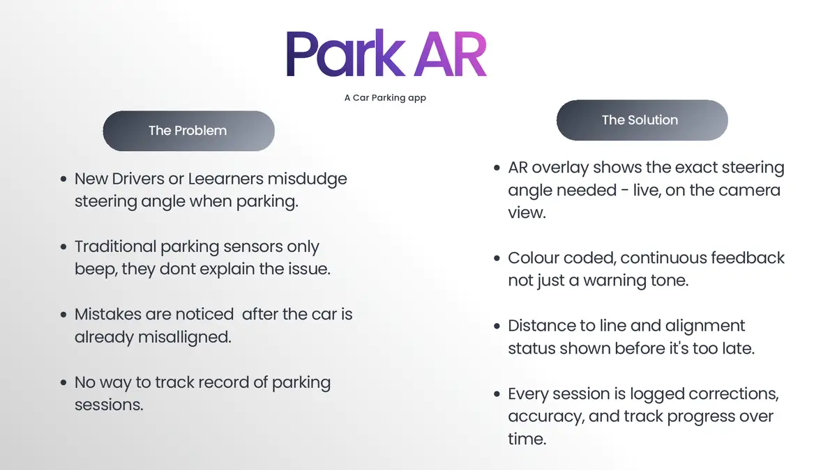
A parking sensor tells you that something is wrong. It does not tell you what to do, and by the time it sounds the car is usually already out of line. Learners and new drivers misjudge steering angle, notice the mistake late, and have no record of whether they are improving.
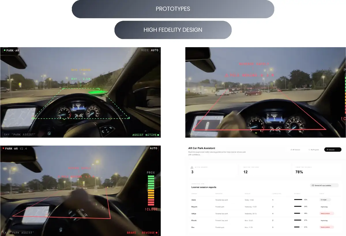
Park AR is an augmented reality parking assistant. It overlays the exact steering angle needed onto the live camera view, colour-codes continuous feedback rather than sounding a warning tone, shows distance to the bay line before alignment fails, and logs every session so corrections and accuracy can be tracked over time.
1.1The four failures of existing parking aids, each answered by a feature.02 - PROBLEM
Why beeping is not guidance
Angle is the hard part. New drivers can see that they are misaligned; what they cannot judge is how many degrees of correction that requires.
Warnings arrive after the error. Proximity sensors fire once the car is already too close, which makes them a report rather than a guide.
Verbal instruction is imprecise. Instructors struggle to convey a steering angle in words, and the explanation varies with the instructor.
No record of progress. Nothing tells a learner whether this week was better than last.
03 - PERSONAS
Three users, three different needs
Three personas framed the work, each needing something different from the same guidance.
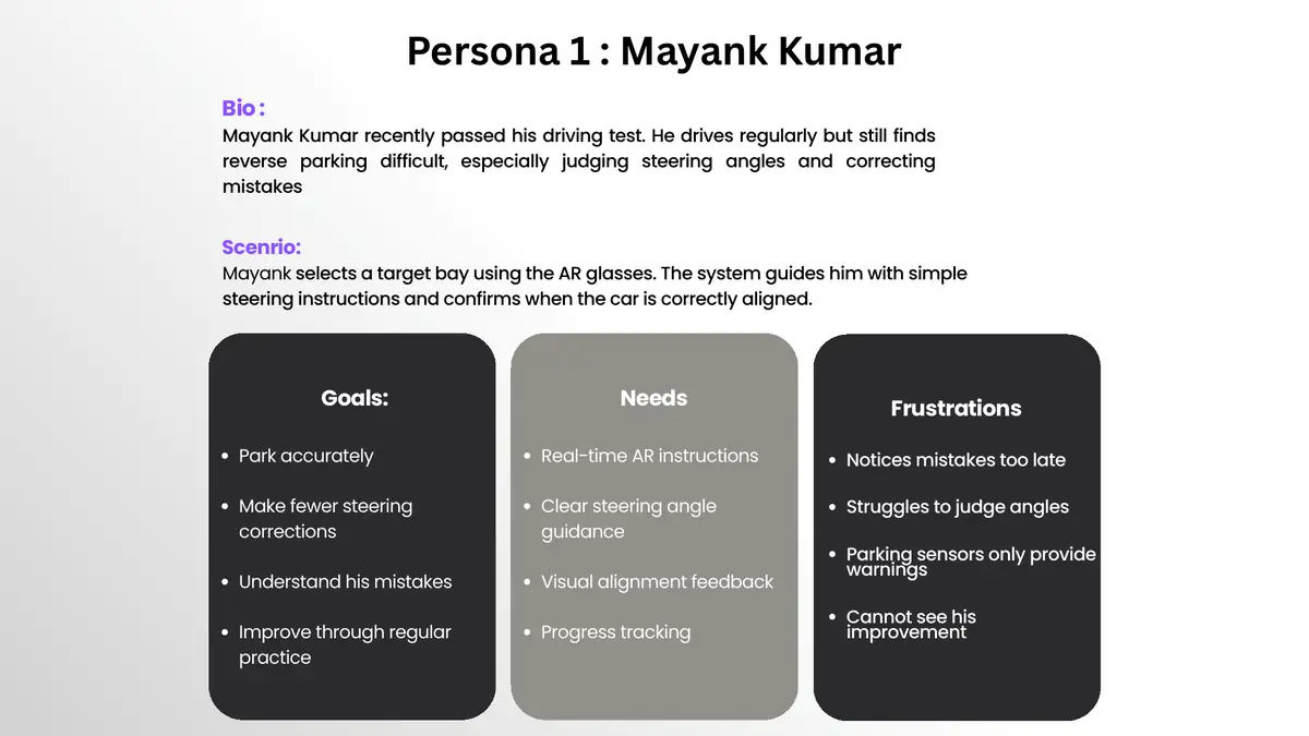
Mayank, newly qualified. Drives regularly but finds reverse parking difficult, particularly judging angles and correcting them. Needs real-time instruction, visual alignment feedback and progress tracking. Notices his mistakes too late.
Alena, driving instructor. Finds steering angles hard to explain verbally. Needs a current-versus-recommended angle comparison and session summaries so feedback stops depending on personal judgement.
Dev, nervous learner. Becomes overwhelmed by several instructions at once and is startled by sudden alerts. Needs one instruction at a time, short language, and calm audio and visual guidance.
Dev is the persona that shaped the most design decisions. Designing for someone who finds the interface itself stressful forces restraint on every screen.
3.1Mayank, the primary persona.04 - USER SCENARIO
One manoeuvre, four moments
The scenario is deliberately small: a single reverse into a busy loading bay, broken into the four moments where the system has to say something useful.
Reversing in. The app reads vehicle movement and displays "Turn steering wheel 30° left."
Under-correction. He turns only 15°. The response is immediate and specific: "Steering angle too shallow, turn an additional 15° left."
Session summary. One correction this time against three last week, shown straight after parking.
That last moment is the one that separates this from a parking sensor. The feedback does not end when the manoeuvre does.
05 - USER FLOW
Voice in, guidance out
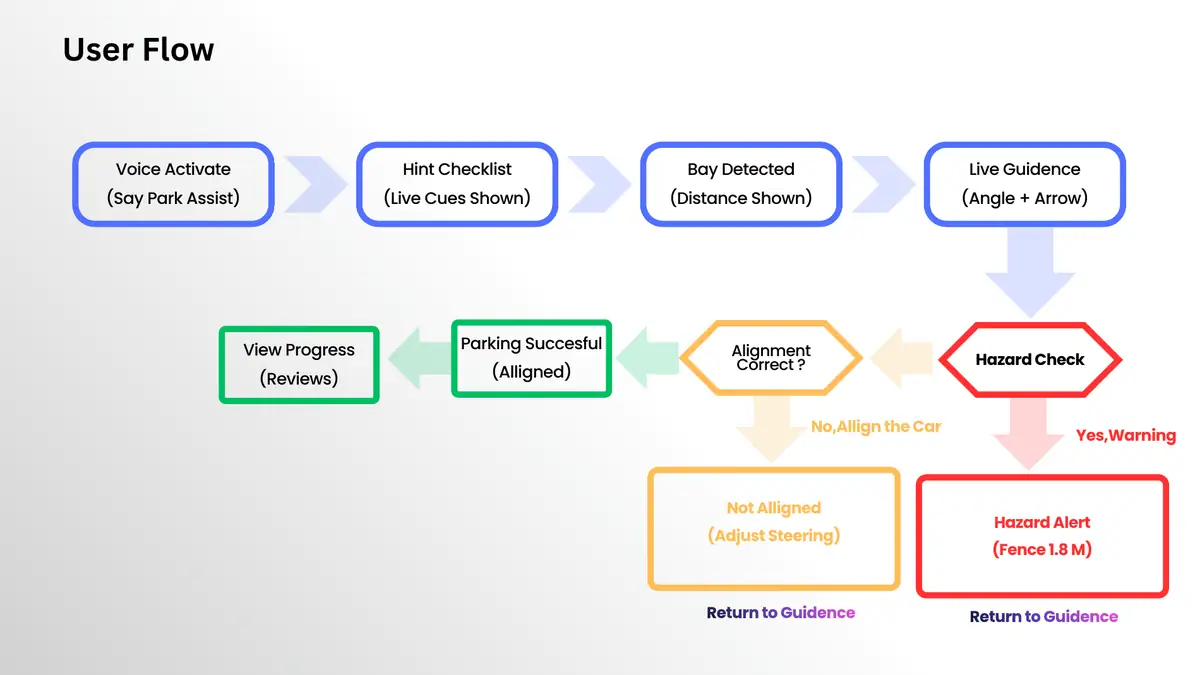
Hands stay on the wheel, so the session opens on a voice command. The flow branches on alignment and on hazard detection, with both branches returning to guidance rather than ending the session.
5.1Activation to summary, with the two failure branches.06 - SYSTEM ARCHITECTURE
How the guidance is produced
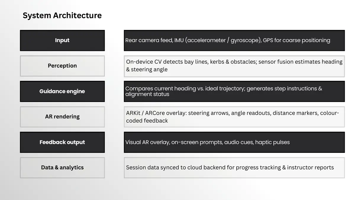
Six layers, from raw sensing to the instructor dashboard. I owned this model and the instructor-facing end of it.
Input. Rear camera feed, IMU, and GPS for coarse positioning.
Perception. On-device computer vision detects bay lines, kerbs and obstacles; sensor fusion estimates heading and steering angle.
Guidance engine. Compares current heading against the ideal trajectory and generates step instructions and alignment status.
AR rendering. ARKit or ARCore overlay: steering arrows, angle readouts, distance markers, colour-coded feedback.
Data and analytics. Session data synced for progress tracking and instructor reports.
6.1The six layers.07 - SENSING STRATEGY
Split the sensing between glasses and car
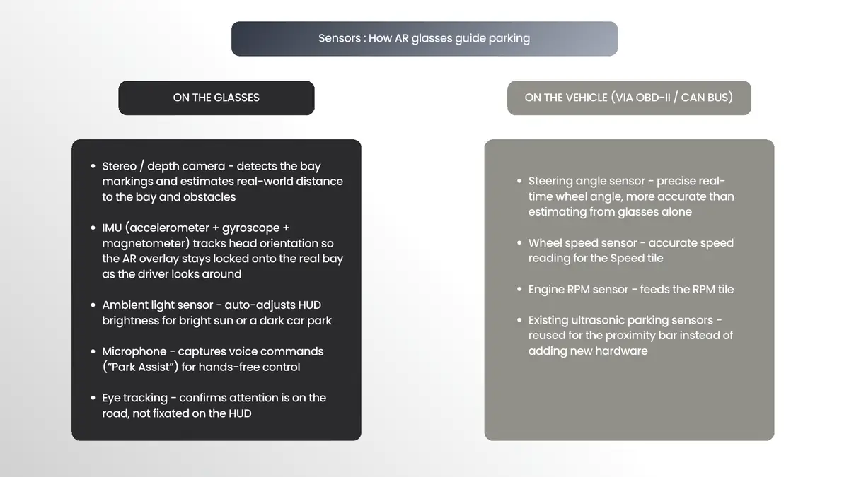
The glasses carry a stereo depth camera, IMU, ambient light sensor, microphone and eye tracking. The vehicle already measures steering angle, wheel speed and RPM over OBD-II, and its existing ultrasonic sensors can be reused for proximity rather than adding hardware.
The reasoning matters more than the list. The glasses can see where the bay is, but the car measures its own motion more precisely than any camera or IMU can estimate. The guidance engine fuses both streams instead of relying on optical estimation alone.
7.1What each device is actually good at.08 - ACCESSIBILITY LAYER
One system, two rendering profiles
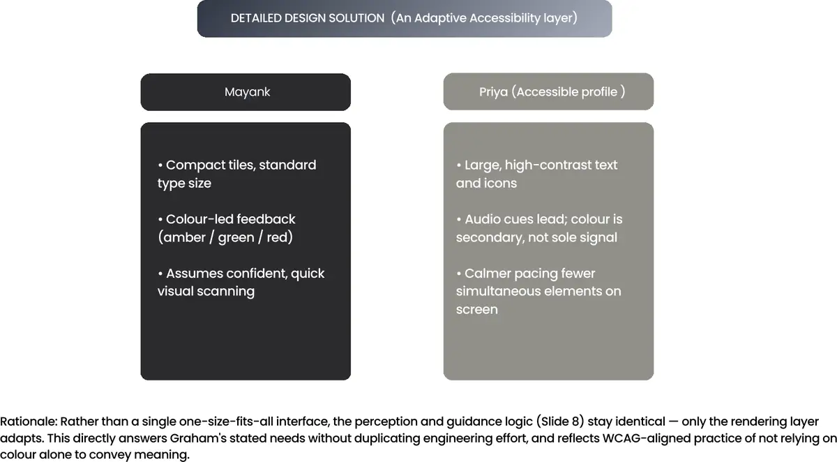
Rather than a single interface for everyone, the perception and guidance logic stay identical and only the rendering layer adapts. The standard profile uses compact tiles, standard type and colour-led feedback, assuming confident, quick visual scanning. The accessible profile uses large high-contrast text and icons, leads with audio so colour is secondary rather than the sole signal, and paces guidance more calmly with fewer simultaneous elements on screen.
This is WCAG-aligned practice applied to an AR interface: never rely on colour alone to convey meaning. It also answers a stated user need without duplicating engineering effort, since the logic underneath is unchanged.
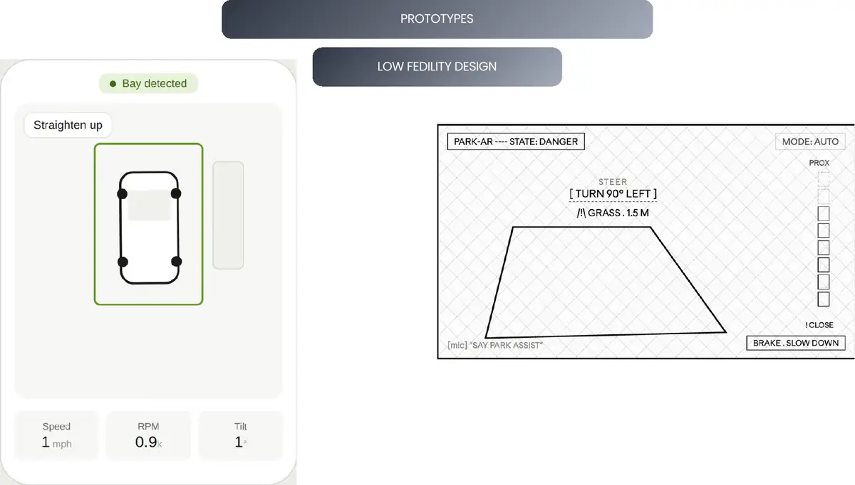
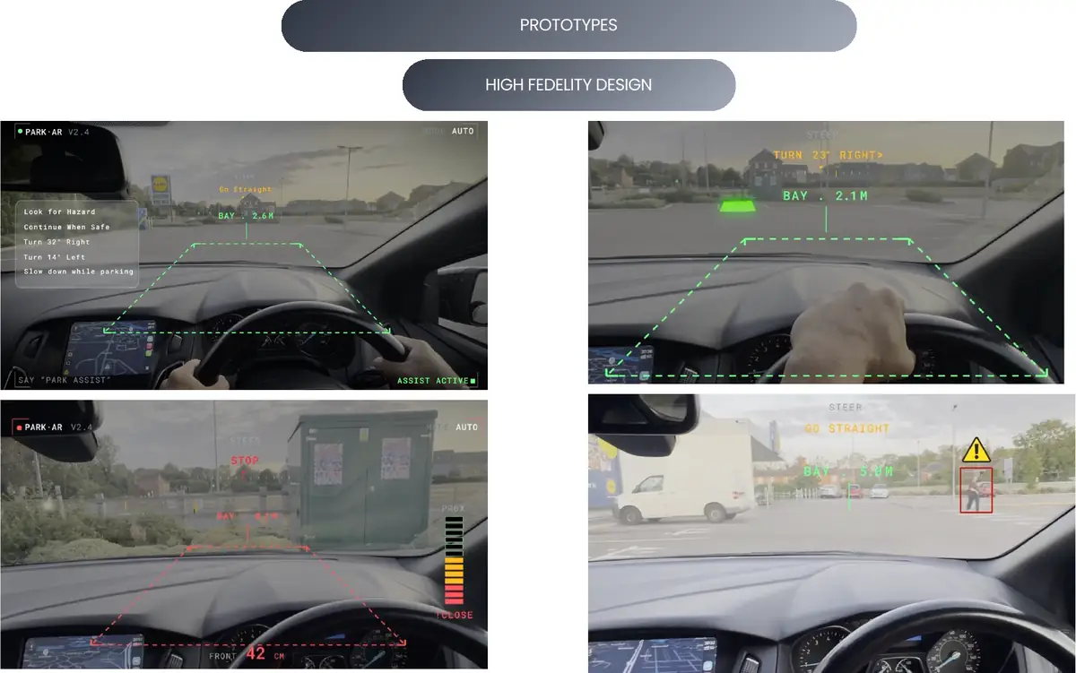
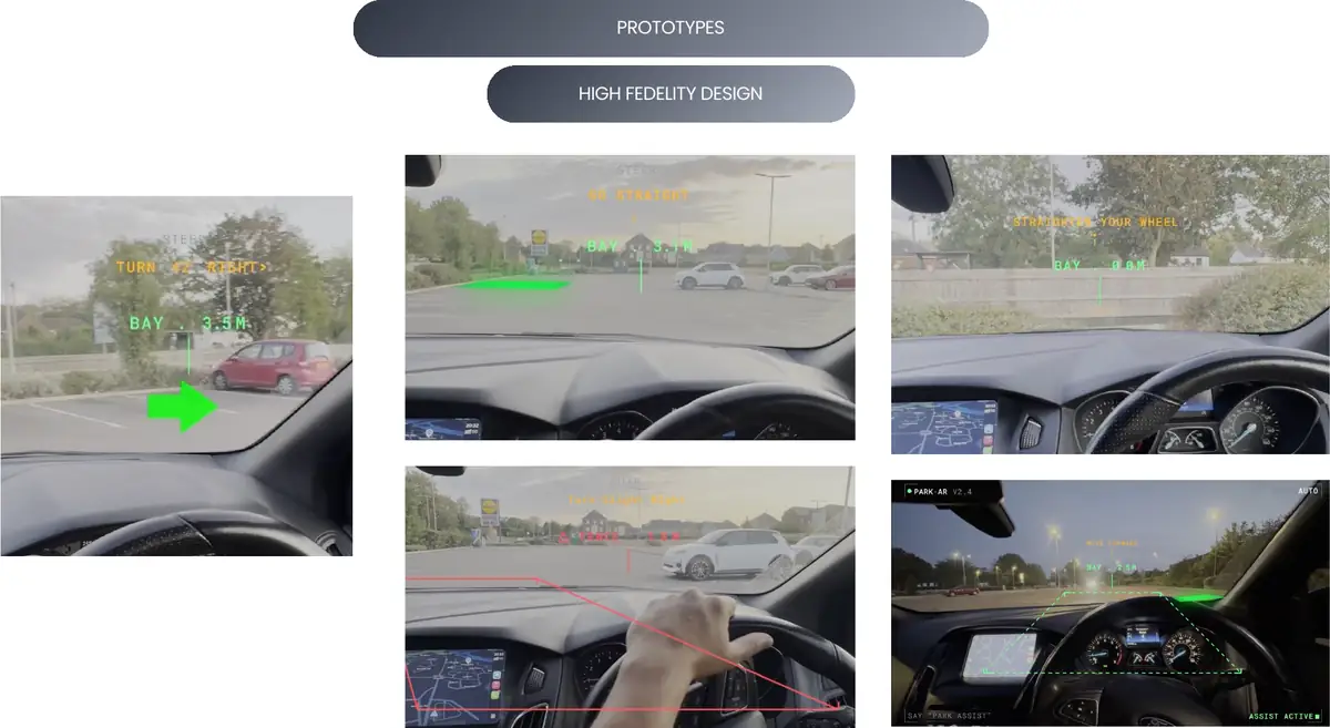
I built both fidelities. The low-fidelity pass settled where information could sit without covering the road; the high-fidelity pass tested whether it survived real light, real glass and a real dashboard.
9.1Low fidelity: placement before polish.
9.2High fidelity, composited onto real driver-view footage. Amber for correction, green for aligned, red for boundary breach.
9.3Guidance states.
9.4Summary and instructor review.
10 - SENSORY FEEDBACK
Three channels, not one
Audio. A rising tone as the angle approaches correct, with a distinct alert for exceeding the line.
Haptic. A short pulse confirms alignment; a double pulse warns of an obstacle.
Colour. Amber for correction needed, green for aligned, red for boundary breach.
Mapped against the 3D interaction taxonomy, the interface uses selection (tapping the highlighted bay), rotation (the guidance engine comparing initial and target orientation as a degree readout) and system control (one tap or voice command moving between detection, guidance and summary). The paradigm is mobile video see-through AR, with an optional wearable extension for the instructor.
11 - PERCEPTUAL DESIGN
Decisions made before building
Reviewed against three categories of perceptual challenge in XR, ahead of the prototype rather than after it.
Technological. Latency during fast corrections would be dangerous, so tracking runs on-device rather than round-tripping to the cloud. Limited camera field of view means the engine estimates bay markers outside the frame.
Perceptual. Depth judgement is hardest in 2D, so a simple distance-to-line marker replaces true depth. Overlays always render on top, never behind real-world elements. Colour-coded feedback was chosen for outdoor brightness variability.
Human factors. The phone mount is fixed to minimise eye travel from the road, guidance is disabled above a safe manoeuvring speed, and calm audio and haptic cues are favoured over an intrusive visual HUD.
12 - EVALUATION
Two techniques, triangulated
I designed the evaluation and ran the analysis. A single method would have given either numbers without reasons or reasons without numbers, so the study pairs self-report with observed behaviour.
Technique one, complete. Self-report questionnaire, n=8, recruited to match the personas. Seven Likert-style usability statements plus two open-text questions, giving mean agreement per statement alongside manoeuvre-difficulty selection and free-text comment.
Technique two, in progress. Moderated, task-based sessions with three to four participants, capturing corrections per park, completion time and alignment success, with think-aloud and two structured follow-ups.
Results
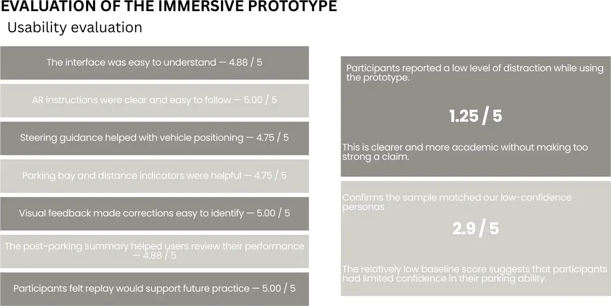
AR instructions were clear and easy to follow: 5.00 / 5
Visual feedback made corrections easy to identify: 5.00 / 5
Participants felt replay would support future practice: 5.00 / 5
The interface was easy to understand: 4.88 / 5
The post-parking summary helped users review performance: 4.88 / 5
Steering guidance helped with vehicle positioning: 4.75 / 5
Parking bay and distance indicators were helpful: 4.75 / 5
Reported distraction while using the prototype: 1.25 / 5
Baseline confidence in own parking ability: 2.9 / 5
12.1Mean agreement per statement, n=8.13 - FINDINGS
What the results tell us, and what they do not
Every core usability item scored between 4.75 and 5.0, with unanimous agreement that visual feedback and replay aided understanding. That supports the perceptual decisions: colour-coded, always-on-top overlays.
Distraction stayed at 1.25 / 5 despite dense on-screen information, suggesting the human-factors constraints of speed-gated guidance and calm feedback worked as intended.
A baseline confidence of 2.9 / 5 confirms the sample genuinely matched the low-confidence personas rather than being generally capable drivers.
Reverse parking was confirmed as hardest by five of eight participants, validating the scenario choice.
The finding I would lead with in a review: near-ceiling scores and thin free-text responses, answered by five of eight and one of eight respectively, most likely reflect an unmoderated, convenience-leaning sample rather than genuinely flawless usability. Treating 4.9 out of 5 as a result would be the wrong read.
What that changes
Add objective task metrics through moderated sessions instead of relying on self-report.
Standardise every survey item to one 5-point Likert scale and remove mixed agree/strongly-agree wording.
Clarify the wording and anchor direction of the mental-demand question, then re-test.
Actively prompt open-text feedback with a follow-up "why" during moderated sessions.
Recruit instructor-persona participants, who are not represented in this sample.
14 - LIMITATIONS
Limitations and future vision
Current limitations
Steering angle is estimated from phone IMU and optical flow, which is less precise than a direct vehicle connection.
Computer vision accuracy drops in poor lighting and heavy rain.
The n=8 sample skews to novice and learner drivers; the instructor persona is untested.
The self-report survey lacked a validated instrument and moderated observation.
Where it goes
Direct OBD-II and CAN bus integration as standard, replacing IMU estimation.
Consumer AR glasses as the primary device, with the phone as fallback.
Fleet and driving-school analytics across thousands of learners.
Adaptive coaching that personalises guidance to each driver's habits.
Booking a hotel room you can actually use still means phoning to ask. AccessibleStay answers those questions on the page, for physical, visual, hearing and cognitive access needs.
FOCUS
Accessibility and Assistive Technology
MY ROLE
Individual project. Every persona, screen, evaluation and iteration is mine.
SCOPE
Responsive web application: desktop, tablet and mobile builds from one component library
EVALUATION
Task-based study, 10 participants across four device types
01 - OVERVIEW
Answering the question on the page
"Accessible room" is a label, not an answer. It does not say whether the shower is roll-in, whether a wheelchair can turn beside the bed, whether the alarm is visual, or whether staff are trained. So disabled travellers phone the hotel to ask, which is precisely the barrier research on accessible tourism keeps identifying.
AccessibleStay is a responsive web application for hotel search, comparison and booking, built for people with physical, visual, hearing and cognitive access needs. It addresses all four WCAG principles, and every feature exists to remove a specific barrier rather than to sit on top of the product as an accessibility add-on.
The build includes accessibility-need filtering, a structured accessibility checklist per hotel, a captioned and pausable virtual tour with transcript, a persistent accessibility menu, full keyboard operability, a four-step booking flow with progress indication, live text chat, and hotel comparison.
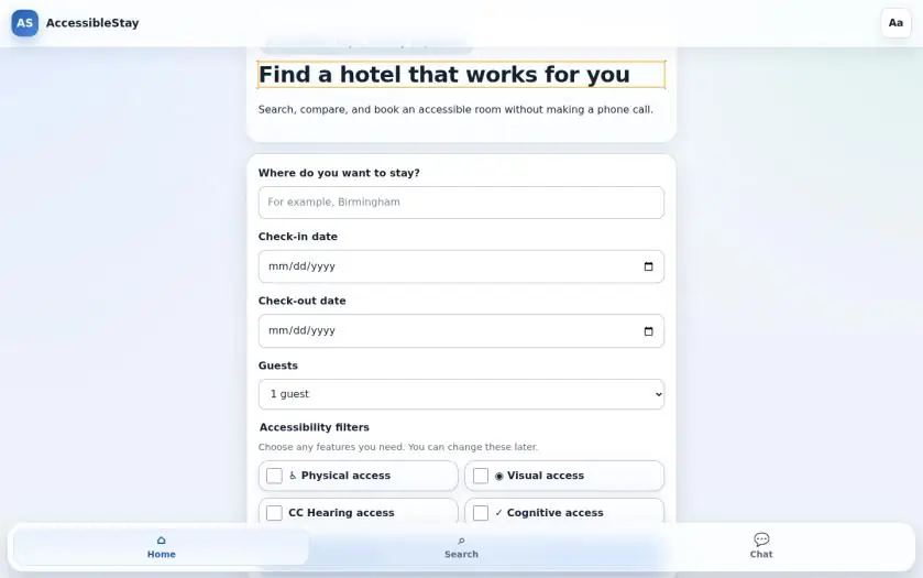
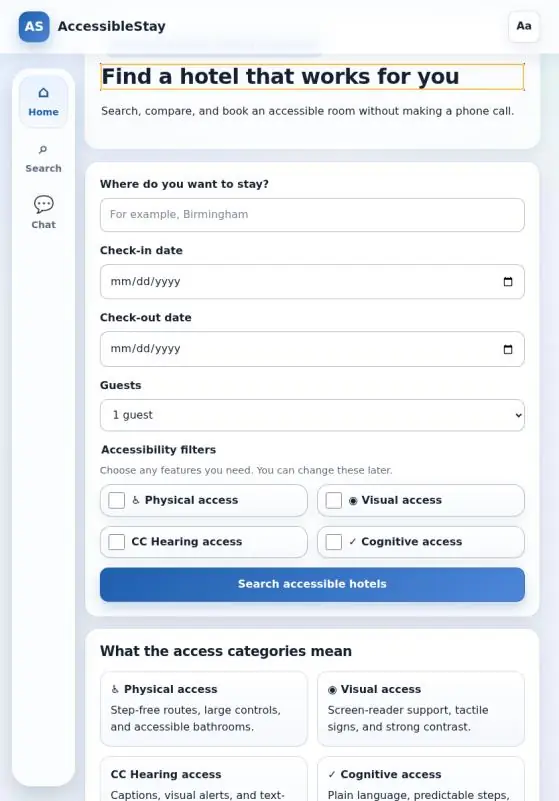
1.1Home screen. The accessibility filters sit in the primary search, not behind an advanced option.02 - PERSONAS
Five people, four kinds of barrier
Each persona carries the WCAG 2.2 criteria their journey depends on, so a design decision can be traced back to a person and forward to a success criterion.
Sarah, 35, full-time wheelchair user. Keyboard navigation, voice-to-text when fatigued. Frustrated by listings that say only "accessible room" and by having to phone to confirm basic facts. 2.1.1 Keyboard, 2.4.7 Focus Visible, 2.5.8 Target Size, 1.3.1 Info and Relationships.
Hortence, 42, severe visual impairment, screen reader and refreshable braille. Frustrated by carousels without alt text and unlabelled fields. 1.1.1 Non-text Content, 1.4.3 Contrast, 1.4.4 Resize Text, 4.1.2 Name, Role, Value.
Harish, 28, profound hearing loss, avoids phone calls. Needs captions and a text channel. 1.2.2 Captions, 3.3.1 Error Identification, 3.3.2 Labels or Instructions.
Arijit, 24, dyslexia. Overwhelmed by dense pages and long forms without a sense of progress. 3.1.5 Reading Level, 3.2.3 Consistent Navigation, 2.4.8 Location, 3.3.7 Redundant Entry.
Kevin, ADHD. Added after the first evaluation, once it was clear the original four under-represented attention and executive-function barriers.
A note I kept in the report and will keep here: personas are design instruments, not claims that everyone with a diagnosis behaves identically. The assumptions are research-informed and still require validation with target users.
03 - PHYSICAL ACCESS
Replacing the phone call with a checklist
Sarah's frustration is not that hotels lack accessible rooms. It is that the listing will not tell her which facts are true, so she has to ring. The hotel page carries a structured accessibility checklist instead: doorway widths, roll-in shower, turning space, alarm type, staff training.
Every interactive element works with Tab, Shift+Tab and Enter alone, with no focus traps. Focus order follows visual and DOM order, and no sticky header or dialog obscures the focus indicator. Controls meet the 24×24 CSS-pixel minimum, and the accessibility controls are built to a 48px target, deliberately more tolerant than the standard requires for tremor or limited dexterity.
3.1The checklist that removes the phone call.04 - VISUAL ACCESS
Three colour-vision modes, not one contrast toggle
Semantic landmarks and logical headings let a screen reader move from the search form to hotel detail. Controls announce name, role and state through ARIA, and changes such as the filtered hotel count are announced through a live region without moving focus.
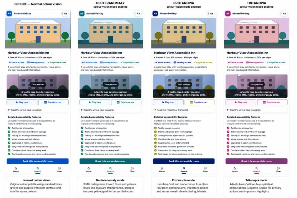
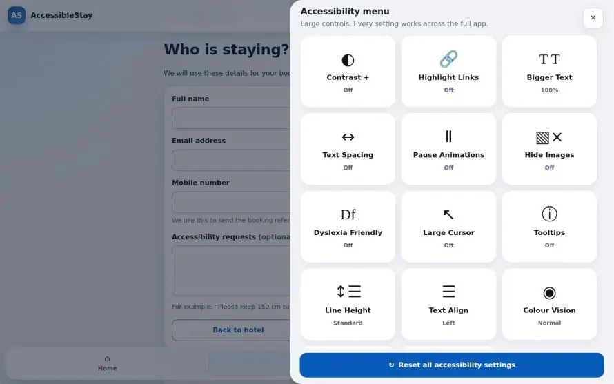
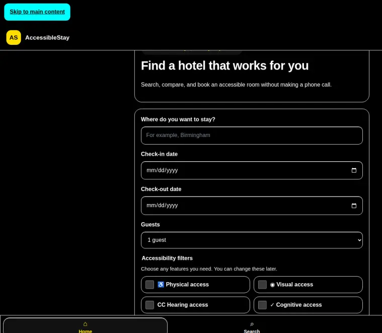
The accessibility menu offers a high-contrast theme, separate text-size and text-spacing controls, and three colour-vision modes: deuteranomaly, protanopia and tritanopia. These replace the primary, success and error colours rather than applying a filter, because the failure mode being designed around is meaning carried by colour alone.
4.1Normal, deuteranomaly, protanopia and tritanopia.
4.2Settings are combinable and persist across pages.
4.3High-contrast theme at magnification.
05 - HEARING ACCESS
No task depends on audio
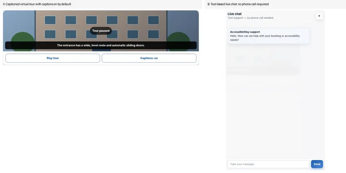
The virtual room tour is captioned by default with a visibility toggle, pausable, and accompanied by a full text transcript carrying the same information. Support runs through live text chat with labelled prompts rather than a phone helpline, and no booking step requires a call. Errors are identified on screen and by email.
Harish's requirement was simple to state and easy to get wrong: he must be able to complete search, booking and confirmation without speaking to anyone.
5.1Captioned tour and text support.06 - COGNITIVE ACCESS
Two conditions, two different designs
Dyslexia and ADHD are treated separately rather than as one "cognitive" bucket, because the barriers differ: reading effort and error recovery for Arijit, attention regulation and working memory for Kevin.
For Arijit: a four-step booking flow with a visible "Step X of 4" indicator, plain-language field-level errors with a page-level summary, no redundant re-entry of information, increased line height and spacing, and an optional OpenDyslexic typeface. The typeface is opt-in deliberately, since the evidence shows no single typographic change works for all dyslexic readers.
For Kevin: an Easy Read mode that shortens sentences and strips secondary information, a "use my location" control that removes typing and recall from search, and hotel comparison that holds several options in one view instead of demanding tab-switching.
Where WCAG 2.2 places useful cognitive provisions at AAA, such as 3.1.5 Reading Level and 2.4.8 Location, I treated them as requirements anyway and traced each to the barrier it removes.
6.1Easy Read mode.
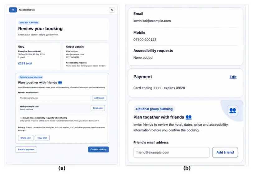
6.2Plan Together. Card details are excluded from what is shared by default.
07 - ACROSS PLATFORMS
Three builds, one component library
Desktop, tablet and mobile share information architecture, components and accessibility settings. Each build changes layout density, navigation placement and touch-target size rather than simply resizing the desktop layout.
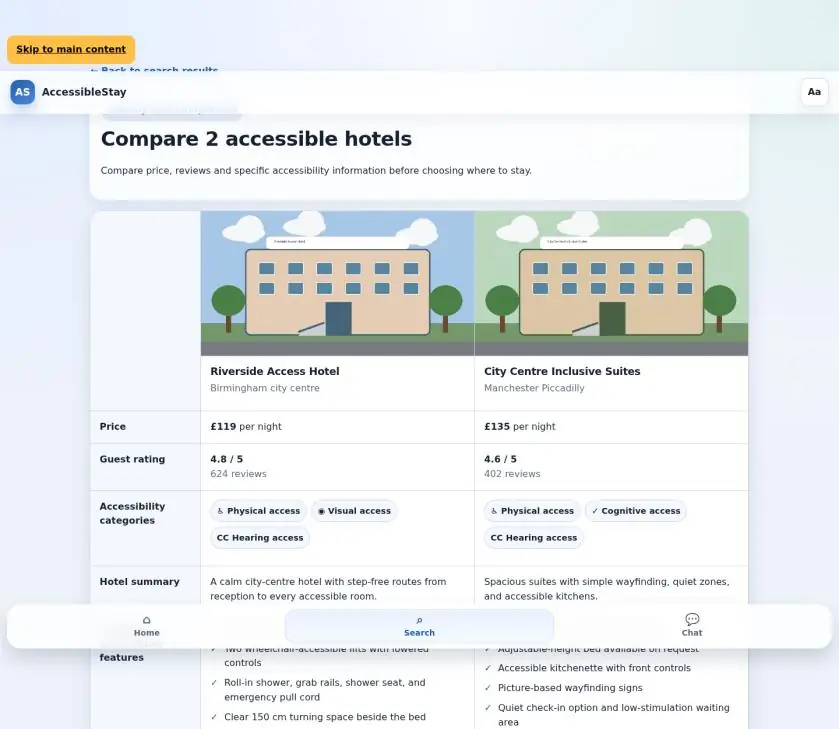
Desktop adds side-by-side comparison of two hotels, keeping price, rating and access features together instead of split across pages.
Tablet replaces the bottom tab bar with a persistent side navigation rail and adds the Plan Together panel to the booking review step.
Mobile collapses multi-column grids to one column, widens the bottom bar, and presents the accessibility menu and chat full-screen rather than floating.
One honest limitation I recorded: the comparison view uses a visual grid rather than a native HTML table, so its reading order and semantics need explicit screen-reader handling.
7.1Desktop comparison, built to reduce working-memory demand.08 - EVALUATION
Ten participants, own devices
A task-based study with ten participants, run on their own devices rather than one controlled machine: four mobile, three laptop, two desktop, one tablet. Two tasks: find a hotel meeting a stated access requirement, then complete a booking to confirmation. Then a five-point Likert survey and five categorical questions.
What came back
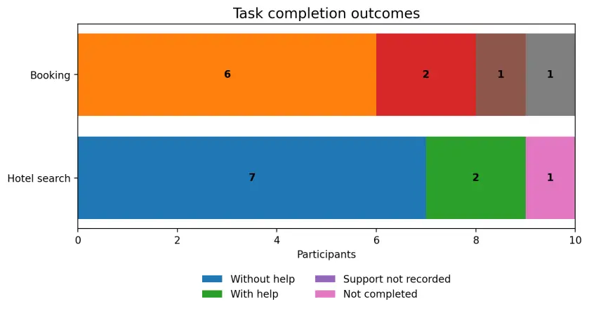
Task completion reached 90% for both search and booking, but independent completion was lower: seven of ten for search, six to seven of ten for booking.
Modern and professional design rated highest at 4.1/5; comparison ease 4.0/5; filter ease, booking clarity and ease of use 3.9/5 each.
80% found the accessibility checklist sufficient; the rest said partly.
80% reported settings persisted correctly across screens.
70% found the interface fully usable after increasing text size and spacing, indicating the layout held but needed work at maximum settings.
Most-used controls were Contrast+ and Bigger Text.
90% said "maybe" or "no" to making a real booking.
That last number is the one worth sitting with. A usable interface that people would not yet trust with a real booking is a finding about credibility, not usability, and no amount of WCAG conformance fixes it.
8.1Completion outcomes. The gap between assisted and independent completion is the real result.09 - ITERATIONS
Three changes the evaluation forced
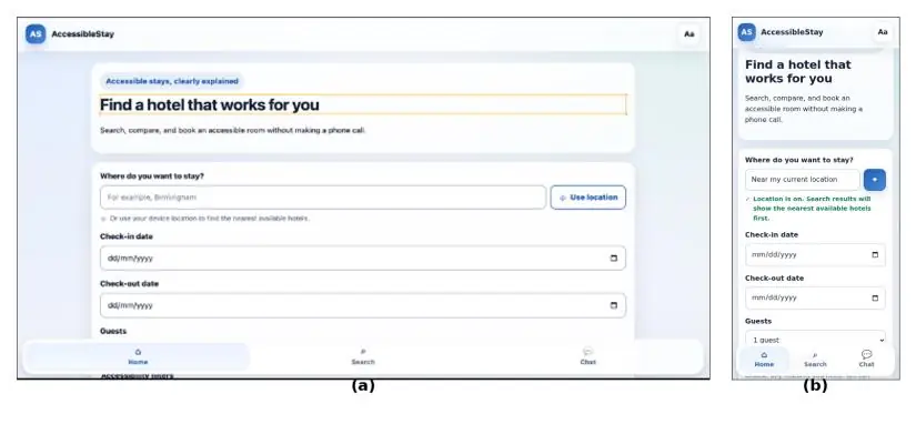
Colour-vision modes replaced a single contrast theme. One "Contrast +" option did not cover the spectrum of colour-vision deficiency, so three palettes were introduced, replacing primary, success and error colours.
Mobile and tablet were rebuilt for text scaling. A dedicated layout layer was needed so cards, navigation and dialogs do not clip or overlap when text size, spacing or line height change. Dialogs became full-screen, touch targets grew, and the bottom bar was widened and re-centred.
A fifth persona was added. Reviewing the recommendations against cognitive-accessibility guidance showed the original four under-represented attention and executive-function barriers, which produced Kevin, Easy Read mode, the location shortcut and comparison.
The second change is the one I would defend hardest: it was a rebuild rather than a patch, because the original layout could not survive its own accessibility settings at maximum.
10 - LIMITS
What this does not prove
Ten participants with no qualitative depth. The results are indicative, not conclusive.
The ADHD features were designed against guidance and checked for WCAG 2.2 conformance, but have not been tested with ADHD participants.
Participants were not recruited as assistive-technology users, so screen-reader performance is argued from semantics rather than demonstrated.
The mobile build remains inadequate for a braille and screen-reader user like Hortence, since enlarged text does not avoid horizontal scanning.
The comparison grid needs explicit screen-reader semantics before it could ship.
The point of listing these is that an accessibility project which claims to be accessible without disabled participants has proved conformance, not usability. Those are different things, and the distinction is the most useful thing I took from this project.